UX RESEARCH & UI DESIGN
INDUSTRY
E-COMMERCE
YEAR
2022
TEAM
2 PEOPLE


Introduction
This project is part of the final exam for one of the subjects in my master’s degree, specifically E-Commerce.
I had the opportunity to collaborate with one of the brands within the Luxottica Group, Costa Del Mar, and gain access to real insights in order to rethink the mobile version of Costa’s website homepage.
Costa Del Mar sells eyewear and apparel for water sports, specializing in both men’s and women’s clothing and sunglasses.
Once we identified the main issues together with some of my colleagues, we focused on the ones we considered the most critical and then tested them with users through UserTesting.com.
The results of the interviews ultimately allowed us to develop redesign proposals based on the insights we gathered.
Overview
Project Goal
Platform
Figma
Timeframe
Team composition
Where we started
We started by analyzing what was already there, namely Costa Del Mar’s mobile website as it existed in 2022.
From there, we reviewed the page across multiple browsers and devices, analyzed all the UI components, and tried accessing every link leading to product detail pages or other pages within the website.
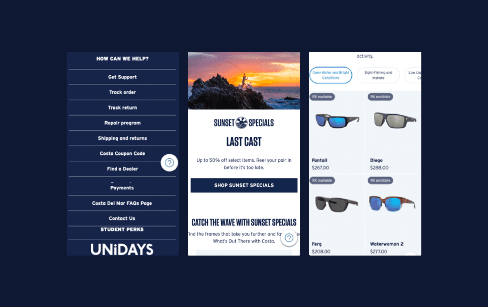
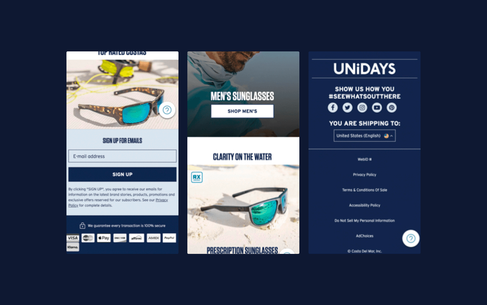
This was our visual starting point. From there, we collected various screenshots to analyze.
Methodology
We decided to use a methodology that would allow us to formulate a hypothesis, assess its immediate consequences, and finally consider the expected outcome—that is, what the hypothesis would lead to if it proved to be true and correct.
This helped us maintain a consistent and unbiased approach across all the issues we identified.
Hypothesis
The are too many categories on the homepage and it’s hard to understand if there’s any hierarchy/relationship between them.
Consequence
The user may not understand how the website is structured.
Result
If the user doesn’t know what page to visit he will not find what he’s looking for.
Problem ranking
To determine the relative importance of each issue, we decided to create a scale from 1 to 3, where 1 represented a minor issue that, although present, was unlikely to lead to the hypothesized outcome, while 3 represented a high probability that, in our opinion, the hypothesized outcome would occur.
Problem
Rank 1
Helper button is too intrusive
Problem
Rank 3
There is no clear hierarchy for categories.
Problem
Rank 3
Too many pop-ups and information.
Problem
Rank 2
The footer has too many information
Qualitative insights
To validate our hypotheses, we asked users specific questions to determine whether they could find a particular category or piece of information on the homepage, or whether they found the design of another Luxottica website better or worse in terms of how easily they could find information.
These questions were the result of focusing on the issues we had ranked as 3 during the research phase.
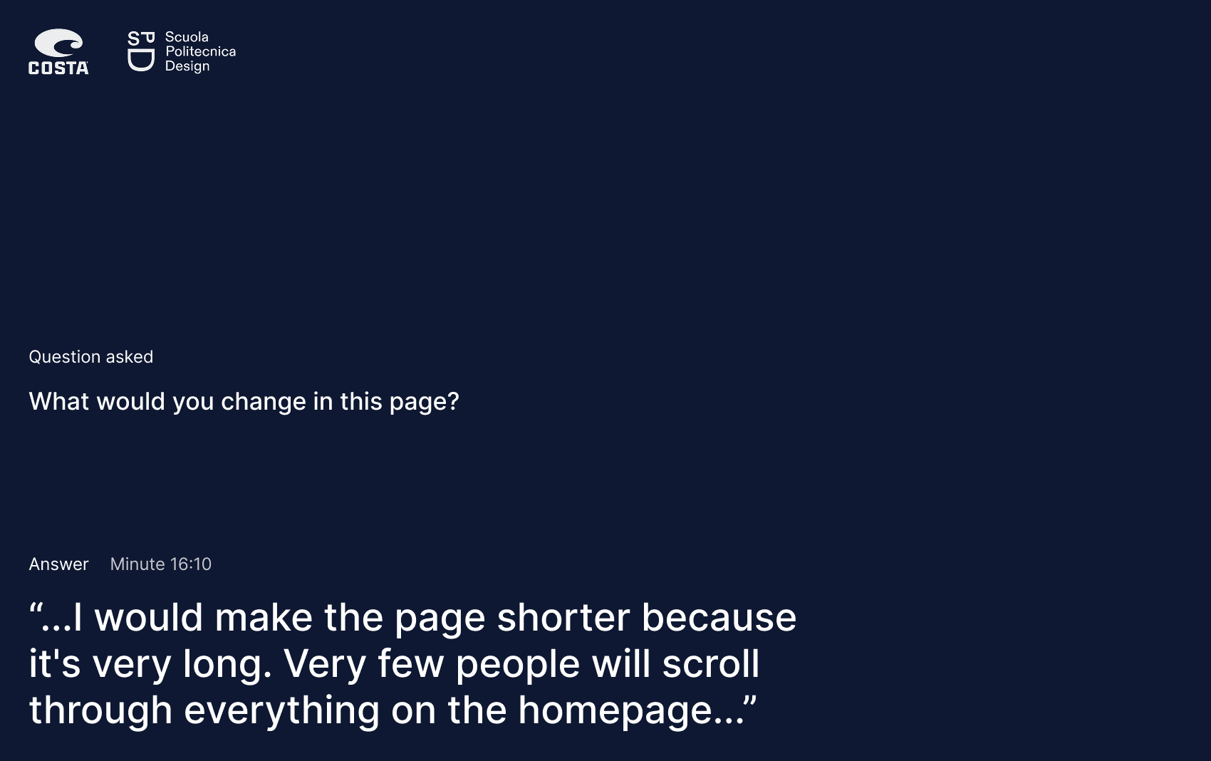
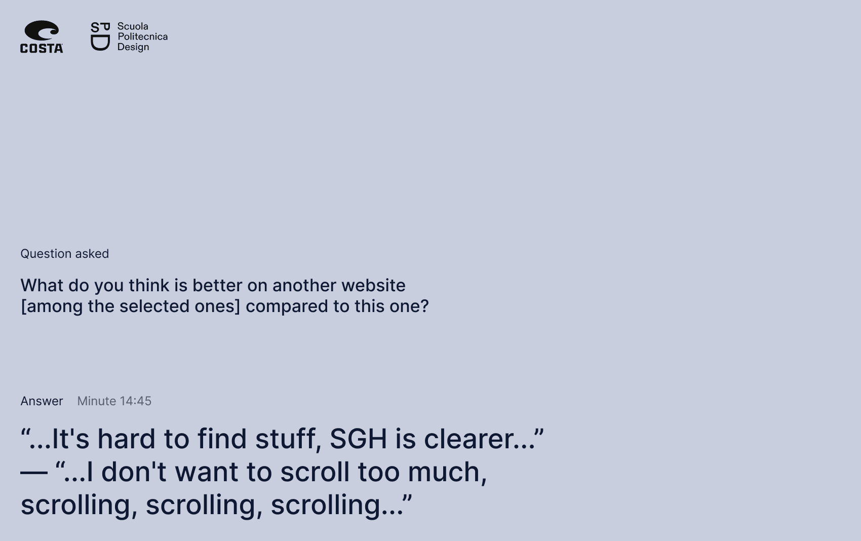
This slide is part of the final project presentation. Several users pointed out that the page was excessively long.
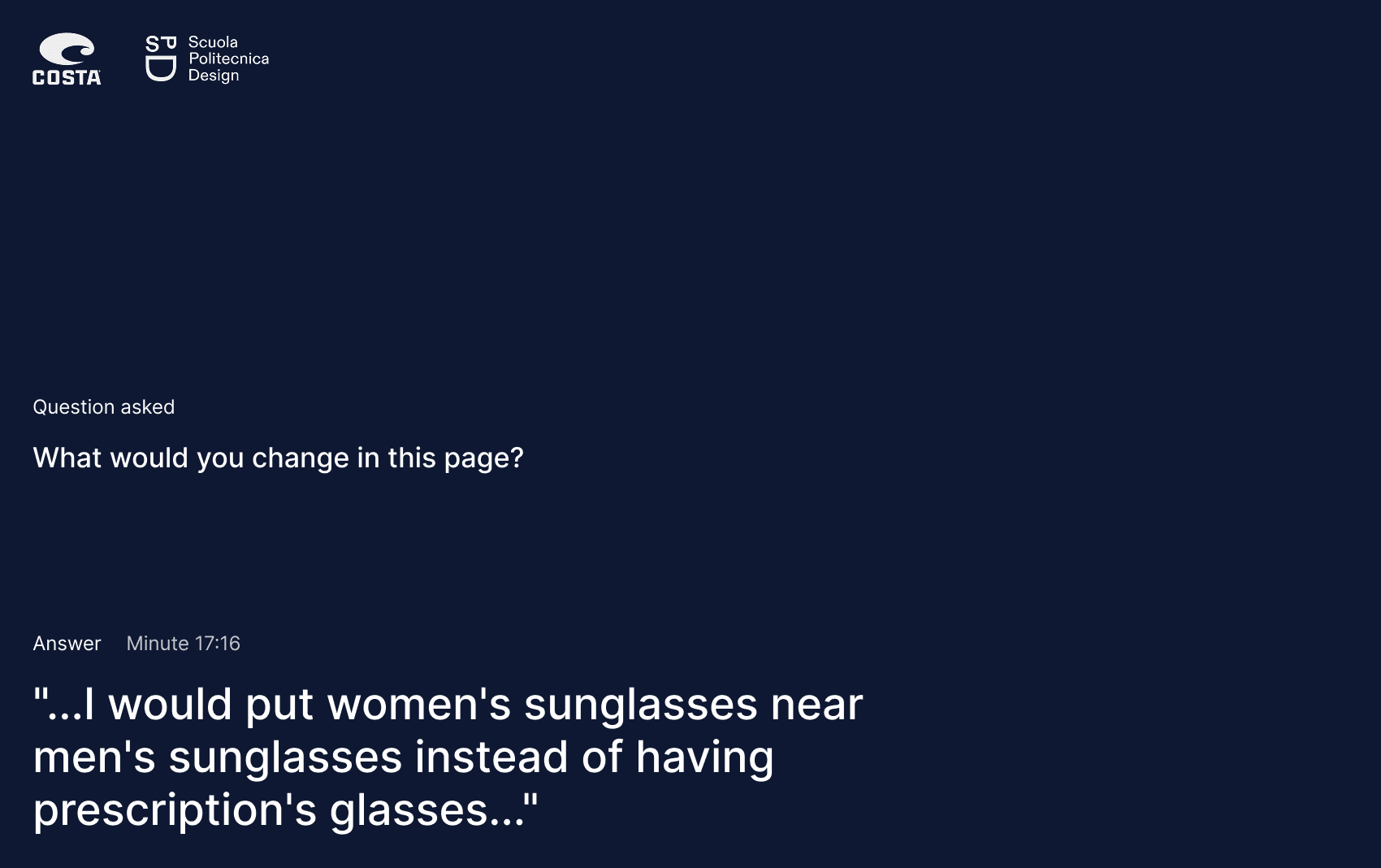
This slide is part of the final project presentation. The fact that men’s eyewear was more prominently featured than women’s eyewear was identified as a negative aspect.
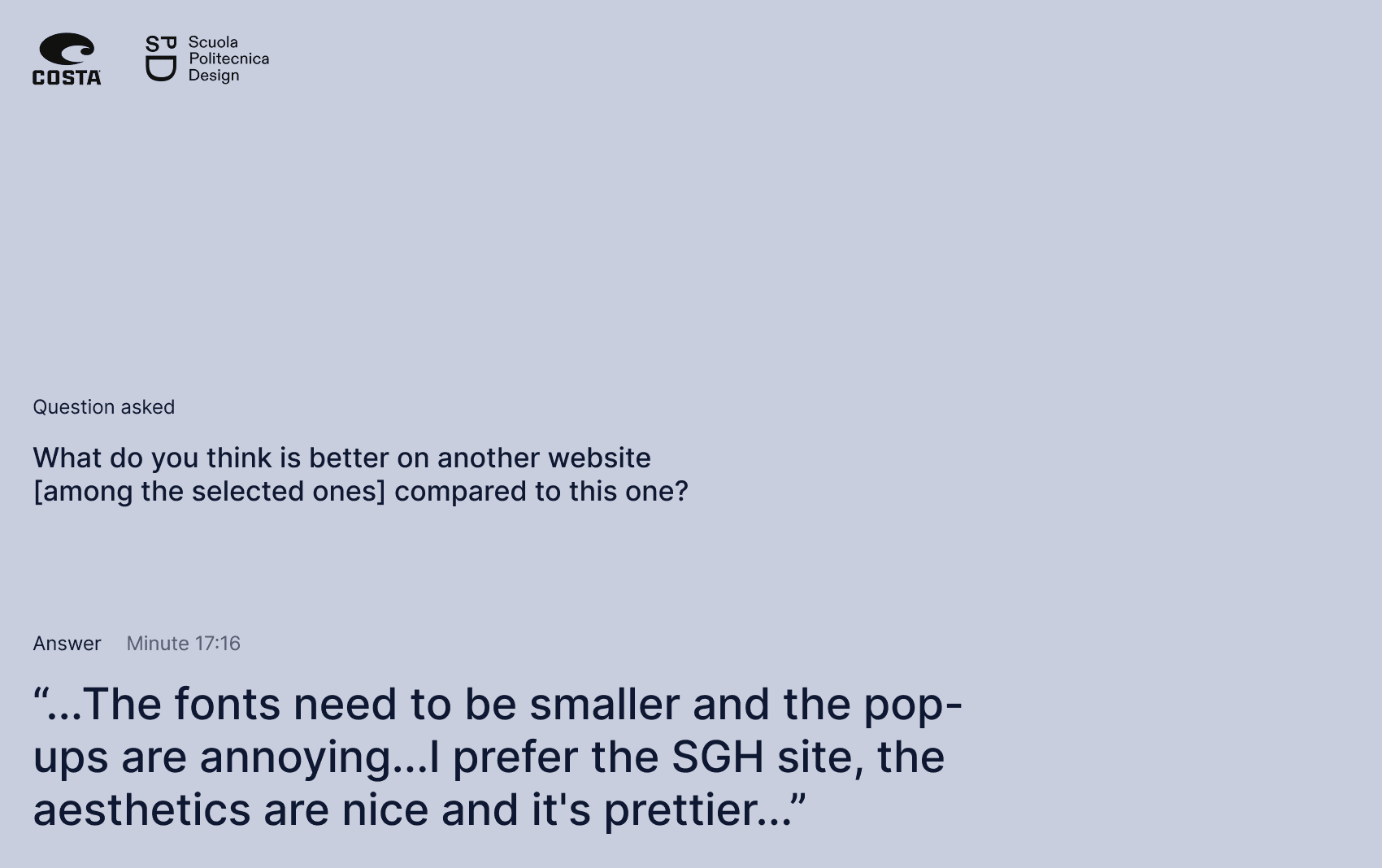
This slide is part of the final project presentation. Users were also shown other websites from the Luxottica Group, such as Sunglass Hut. Many users identified it as a positive example.
Outcome
The redesign focused primarily on three aspects: reducing the length of the page while maintaining the same information, establishing a better hierarchy for visual and informational elements, and refining the existing UI to make the overall experience more cohesive.
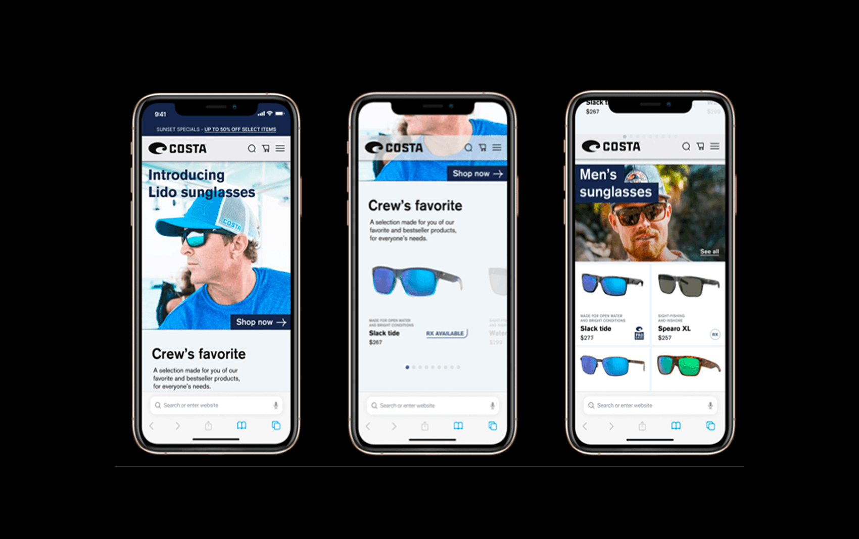
Placing CTAs directly within the images (using absolute positioning) and introducing several carousels allowed us to reduce the overall page length.
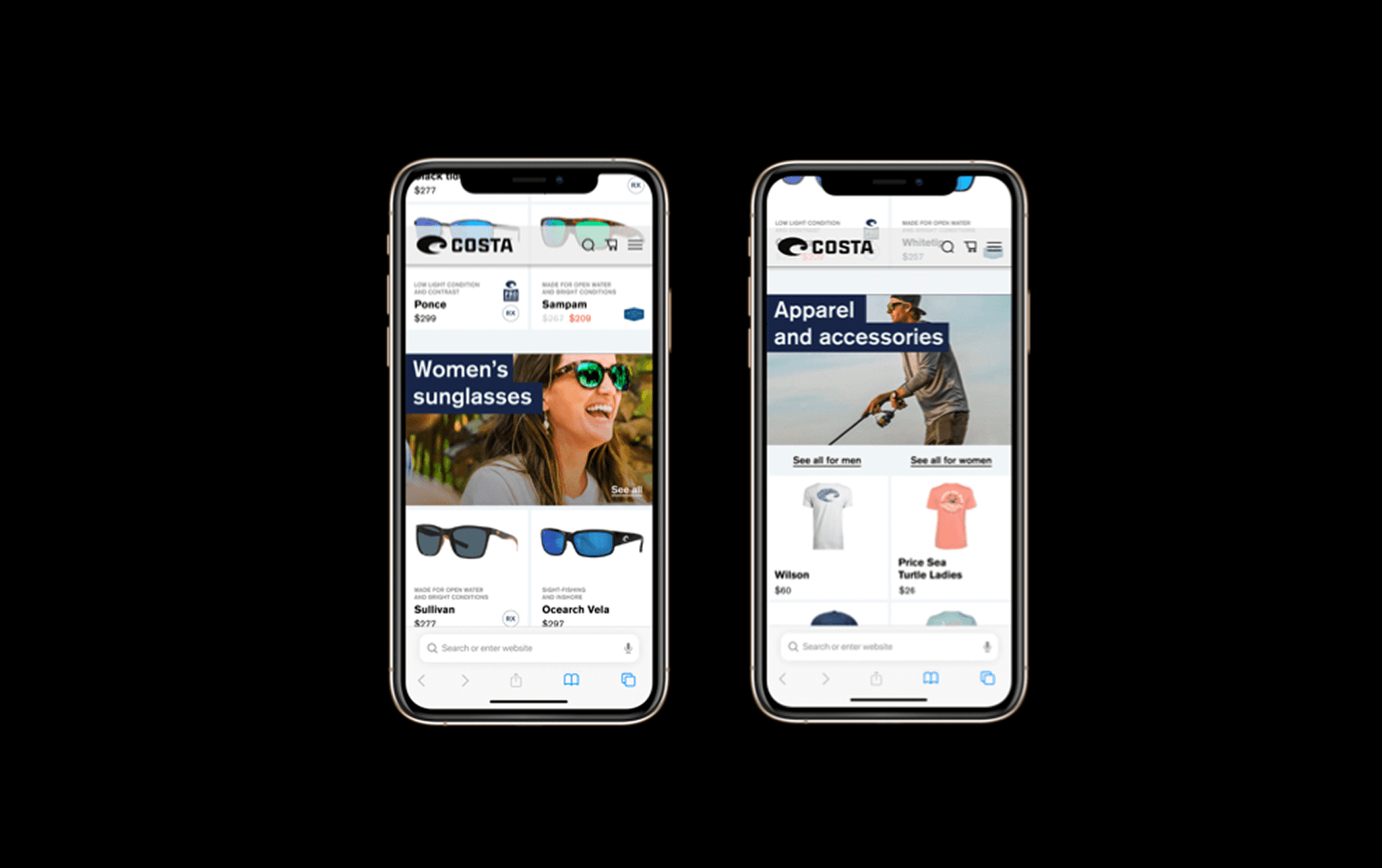
In the redesign, each section has a clear heading with a consistent hierarchy across all sections.
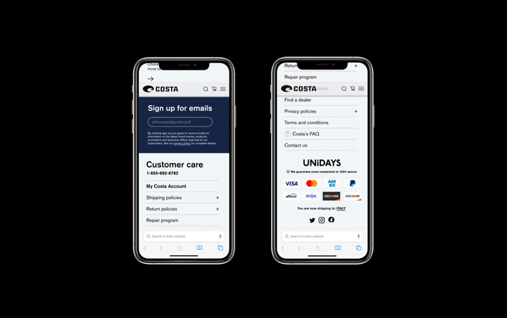
We kept exactly the same information in the footer, but chose to use accordions for secondary information such as policies.
Final thoughts
Although the project is now several years old, it was very important to me—not so much because of the UI we created, but because of the methodology it taught me and the approach to problem-solving that I developed through it.
Although it may seem obvious, it is sometimes easy to forget that design is about solving a problem. If you fail to properly identify the users’ problem, you end up designing blindly and risk creating something that, at best, looks good but is ultimately useless.
Personal learnings