UX/UI DESIGN & VISUAL
INDUSTRY
CULTURE
YEAR
2025/2026
TEAM
3 PEOPLE


Introduction
During my work at Inmagik, I had the opportunity to design several digital archives for institutions and universities. By digital archive, I mean a collection of documents — including text, PDFs, images, videos, and other types of content — focused on specific topics. I decided to showcase three of them.
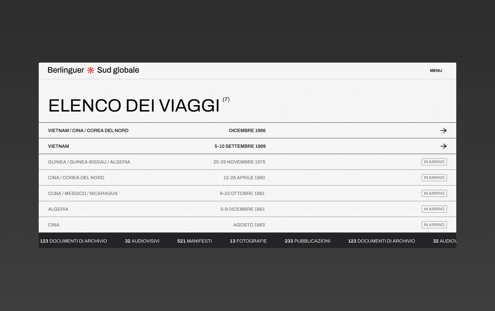
The first is the archive created for the IGER Foundation, Berlinguer e il Sud Globale, focused on documenting Enrico Berlinguer’s travels and the testimonies associated with them.
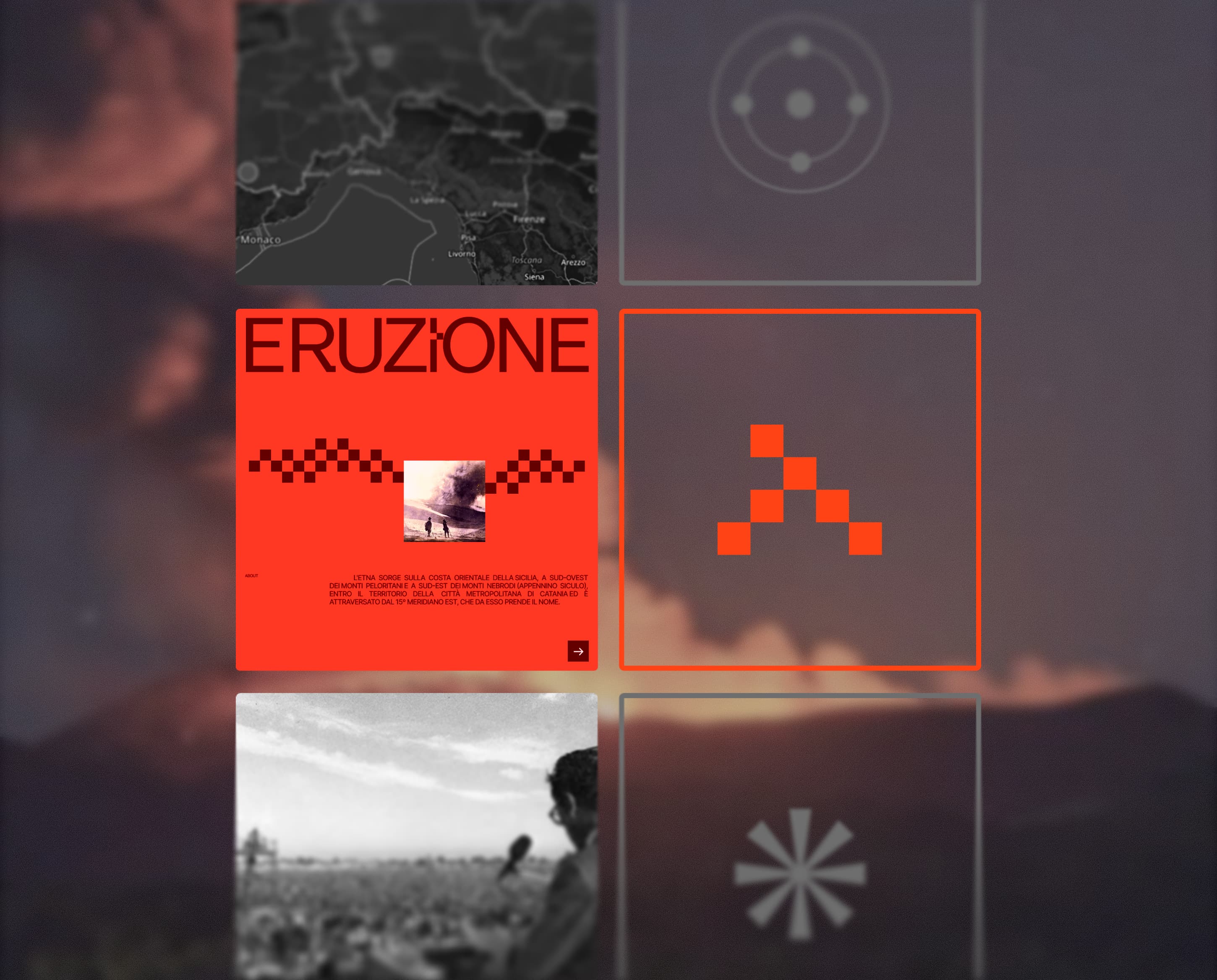
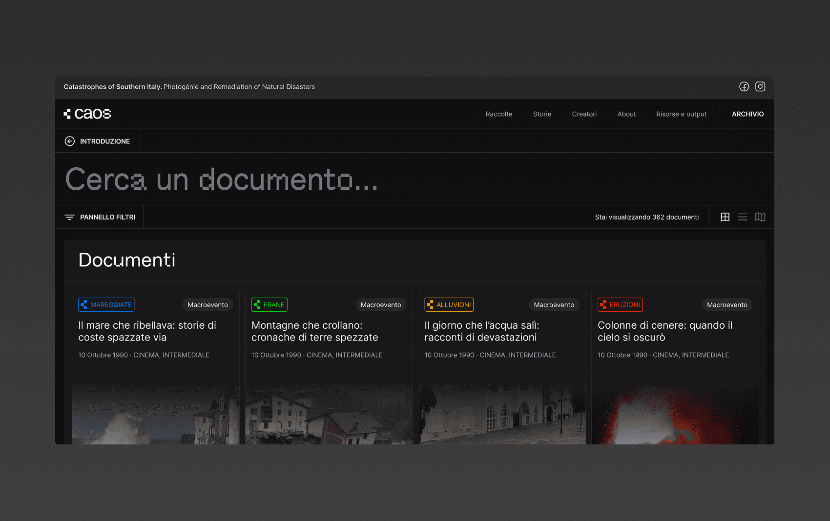
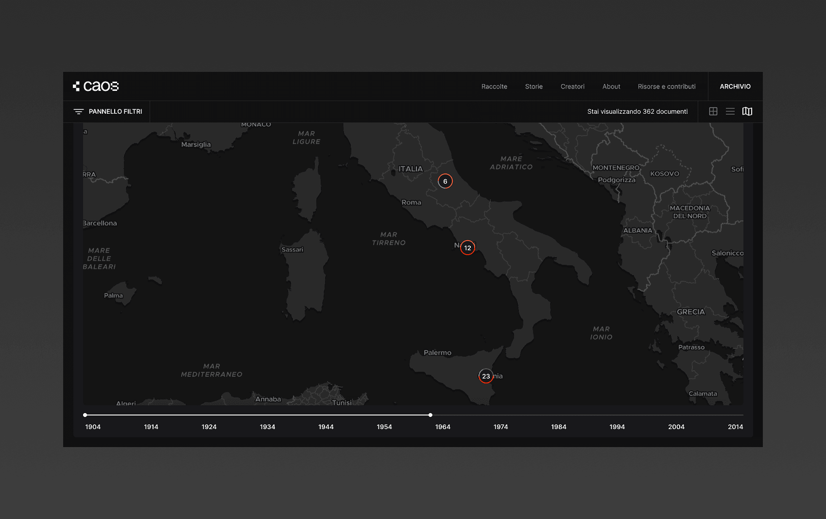
The second is CAOS, created for the University of Catania and the University of Calabria. It collects literary, photographic, audiovisual, television, web, and digital works — both real and fictional — dedicated to destructive natural phenomena in Southern Italy.
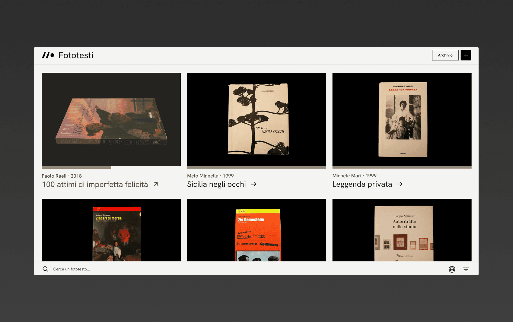
The third and final project is Fototesti Italiani, also created for the University of Catania, which brings together phototexts by Italian authors and photographers.
A single narrative
Although they are three distinct projects, throughout the design process I found numerous points of connection between them. They often shared the same target audience, as well as the dual purpose of preservation and dissemination, despite the differences in their respective media.
For this reason, I chose to present them through a single narrative, as I believe they ultimately share the same, or at least a very similar, purpose.
From a purely design perspective, I also identified patterns and solutions that could often be applied across all three projects, as they are, at their core, digital archives.
Overview
Project Goal
Platform
Timeframe
Team composition
An archive for whom?
Each of the three digital archives shared the same core goals: to host hundreds of documents on a single platform, make them accessible to users, highlight their key characteristics, and support the overall narrative of the website.
Within this common pattern, I found what I believe is the true purpose of tools like these. They are not simply digital repositories for scanned or digitally produced documents, but experiences designed to make the discovery of specific content engaging and credible.
The narrative of culture is the focal point of these projects, with the entire experience built around the content and documents themselves.
Target audience
Although they are three different archives, their target audiences are surprisingly similar. These tools are primarily intended for subject-matter enthusiasts and casual users, as well as academic researchers and university students.
Persona
Persona
Persona
Documents of all kinds
The first thing I did was carefully examine the data models of all three digital archives. Starting from them allowed me to understand the complexity of the media that would populate the platforms.
The main challenge came from the extremely diverse types of media present across each archive. Each platform brought together multiple formats: photographs, PDF documents, text documents, embedded videos, flyers and individual posters, external links, audio, and more.
Working with such a wide variety of media proved to be a significant challenge, both in terms of how the content was represented and how users would experience it.
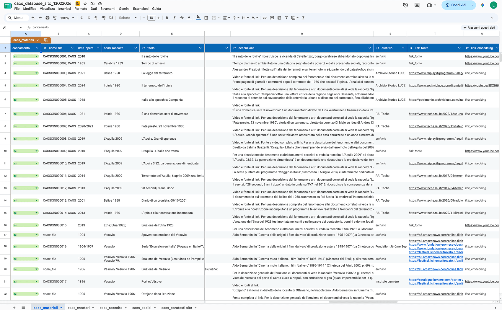
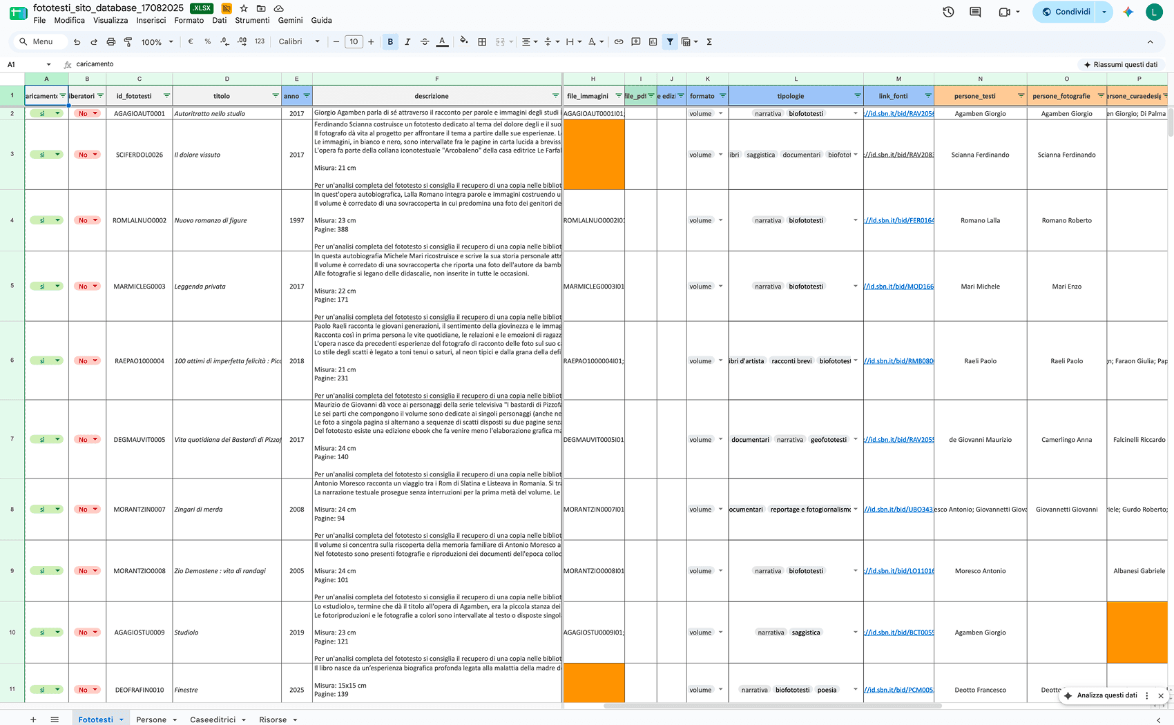
Some of the data models were provided to us in Excel format. I started from there to understand the structure of each media.
Discovery
For each digital archive, I followed almost the exact same workflow. After analysing the data model, I worked closely with the clients, gathering as many insights as possible into what they wanted to achieve.
Displaying the documents remained the essential baseline, but there was also a need for a visual system that was coherent with the story being told.
My discovery process focused primarily on understanding what users actually needed to see and, more importantly, why.
I also explored how much the user experience could be simplified while taking the different types of users into account.
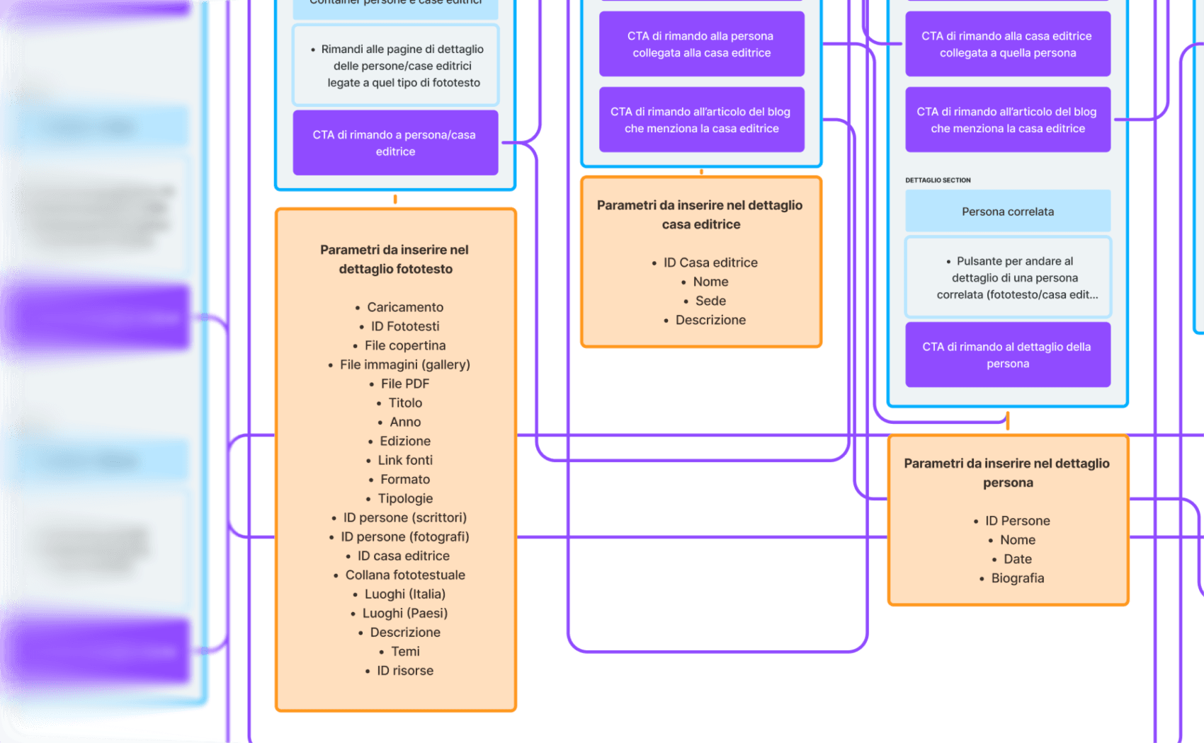
The parameters to include in Fototesti Italiani proved to be more important than I had initially anticipated during the early stages.
In CAOS, representing the phenomenon itself was particularly important rather than treating it as just another filter.
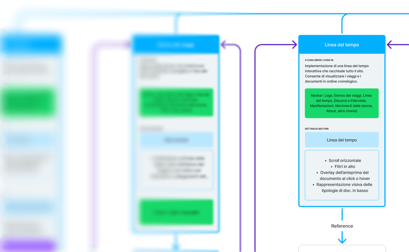
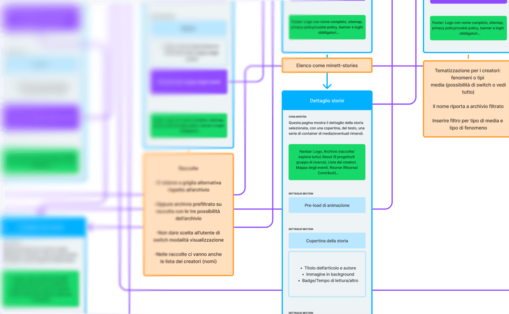
In Berlinguer e il Sud Globale, the temporal dimension took on a particularly significant role.
The temporal dimension plays an important role in supporting the narrative.
Natural phenomena should almost be treated as themes and need to be characterised.
The technical metadata of the phototexts is just as important as the documents themselves.
Visual narrative
Content consumption follows a similar approach across the three archives, with the necessary differences in terms of media type and relevance depending on each project’s scope.
What becomes a key focus, however, is finding, creating, and maintaining a visual style that supports the content in a coherent and natural way.
Before starting the design process, I presented the clients with two visual directions, each supported by a more detailed moodboard, to explore two possible visual narratives for each archive.
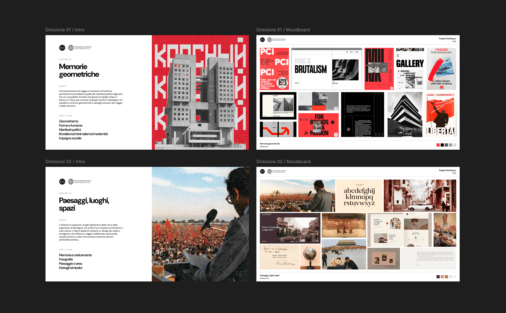
For Berlinguer e il Sud Globale, I proposed two visual directions.
The first featured a brutalist aesthetic, with oversized typography, a predominant use of red, grayscale imagery, and a direct relationship between places and architecture.
The second direction, which was ultimately discarded, aimed for a warmer visual identity, using serif typefaces and a stronger focus on the countries of the Global South that were part of Berlinguer’s travels and represented a significant portion of the archive’s content.
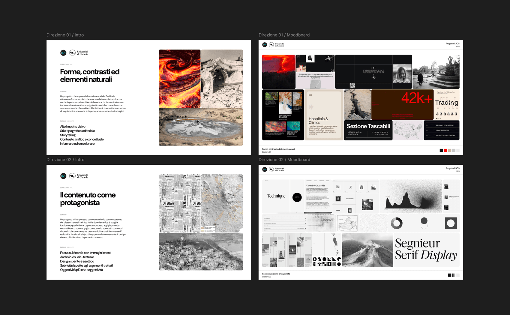
For CAOS, I explored two contrasting visual directions.
The first featured a predominantly black palette, informed by the discovery phase, which revealed a strong prevalence of content related to volcanic eruptions. It also used modern, digital typefaces and an iconography inspired by the different natural phenomena.
The second direction, which was ultimately discarded, moved towards a much more restrained visual style, giving the content ample space while placing significantly less emphasis on the visual narrative.
Why offer two options?
I chose to present two possible directions from the very beginning, with the exception of Fototesti Italiani due to the extremely tight design and development timeline. I believe this is a more effective approach for two main reasons.
First, it gives the client a clear sense of choice, making it easier to imagine and compare two different possible solutions.
Second, it is more efficient in terms of time: I believe this approach is faster and more effective than working through iterations and continuously refining something the client may have accepted simply because there was no alternative.
The visual aesthetic draws from brutalism, oversized typography, and red as a symbol.
The visual aesthetic draws from the digital world, with a strong iconographic representation.
The visual tone blends literary and photographic symbolism, bringing the worlds together.
Once a general visual direction had been defined with the client, I could begin exploring and refining the chosen direction, developing small, cohesive visual systems.
BSG / Visual system
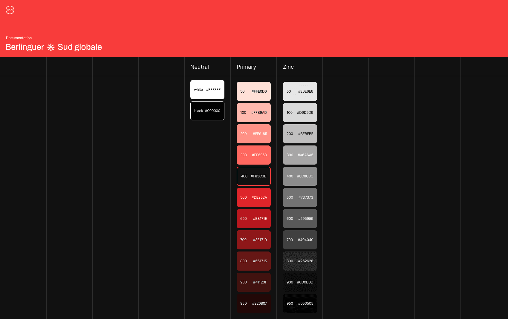
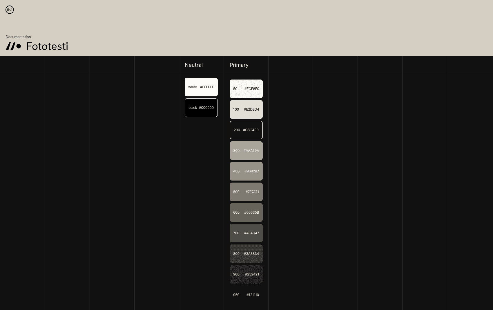
For Berlinguer e Il Sud Globale, I opted for an aesthetic inspired by architectural brutalism, maintaining an overall cool tone while balancing it with warmer, more human elements, such as a serif display typeface.
The primary red acts as a symbolic element and becomes an integral part of the archive’s narrative.
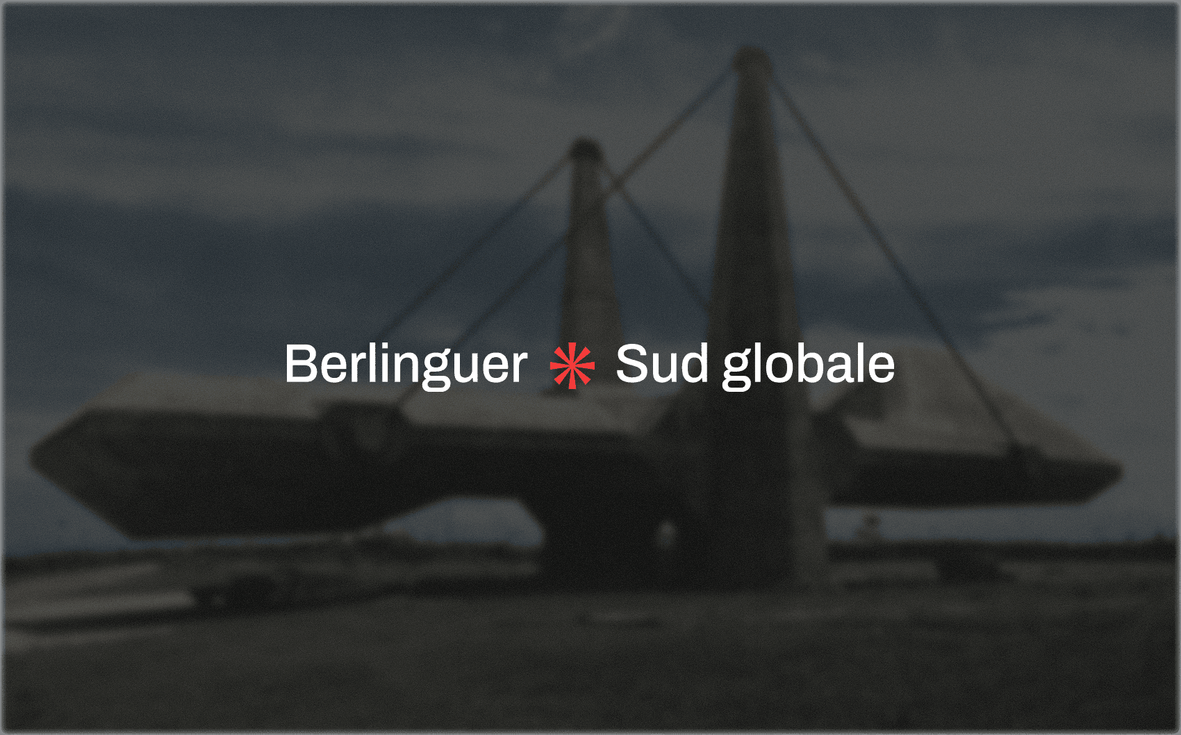
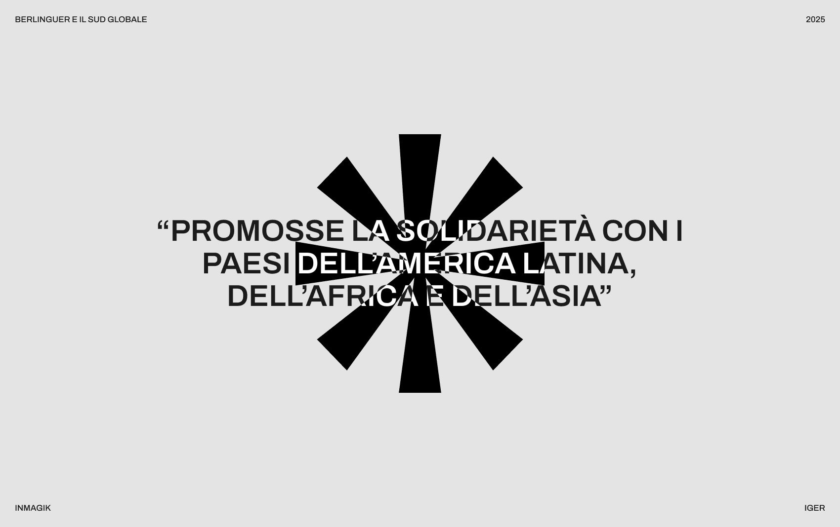
I chose to use a stylised asterisk as a symbol, which I later incorporated into the logotype, to represent the multiple routes of Berlinguer’s travels, evoking a focal point at the centre with rays extending outward.
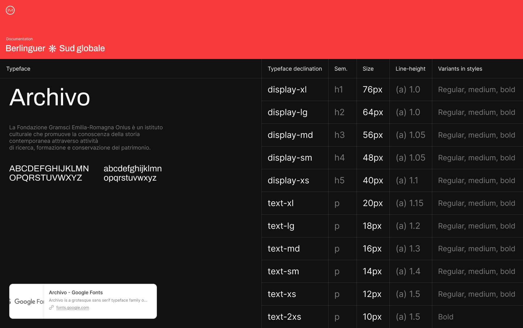
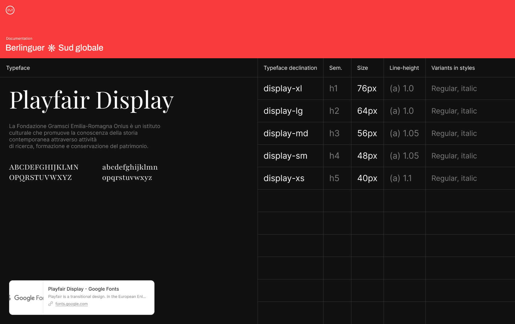
I chose to use two different typefaces to introduce a more human and less cold feel compared to the overall aesthetic. I paired a display serif typeface exclusively with headings, keeping it legible without becoming intrusive.
CAOS / Visual system
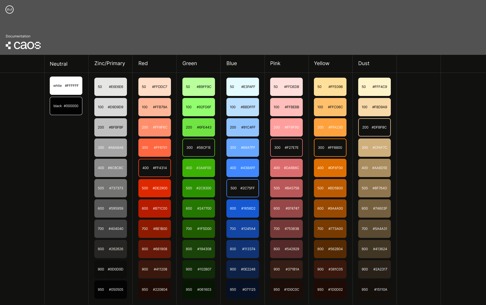
In the case of CAOS, the solution chosen by the client moved towards a particularly strong symbolic direction tied to the phenomena themselves.
The approach was therefore to assign a specific graphic symbol to each category within the archive, combining this system with a dark, highly digital aesthetic.
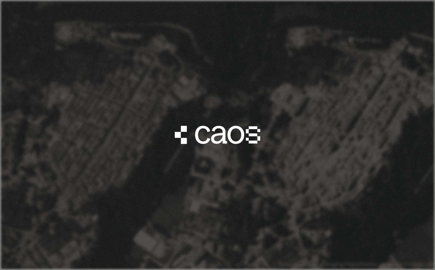
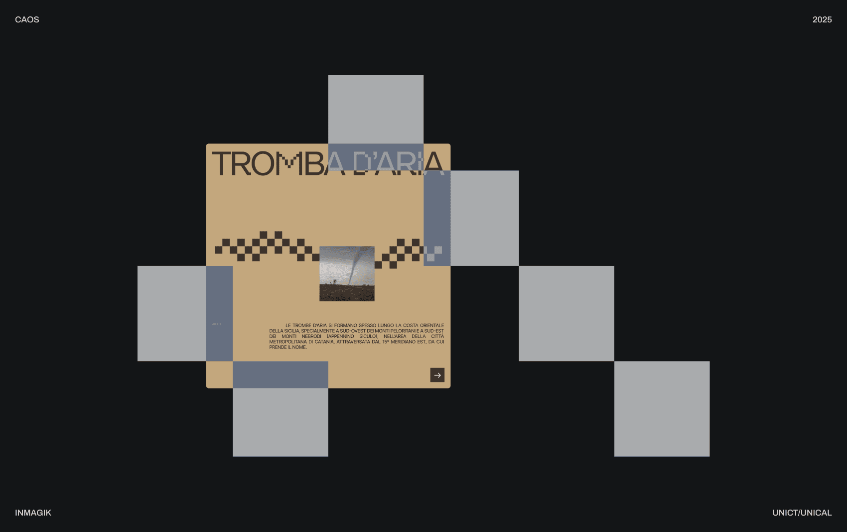
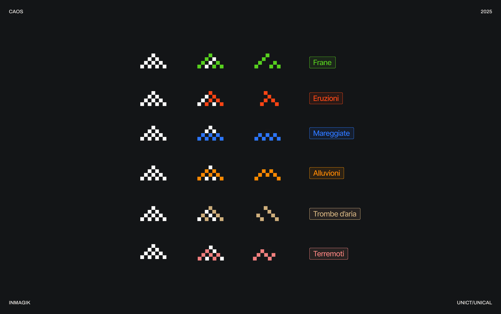
I started from the square, which later became the symbol used in the logo, to represent the shifting, changing, and deformation of the ground caused by a natural phenomenon.
I liked the idea of having several highly abstract symbols that could act as visual companions without becoming overly descriptive or illustrative.
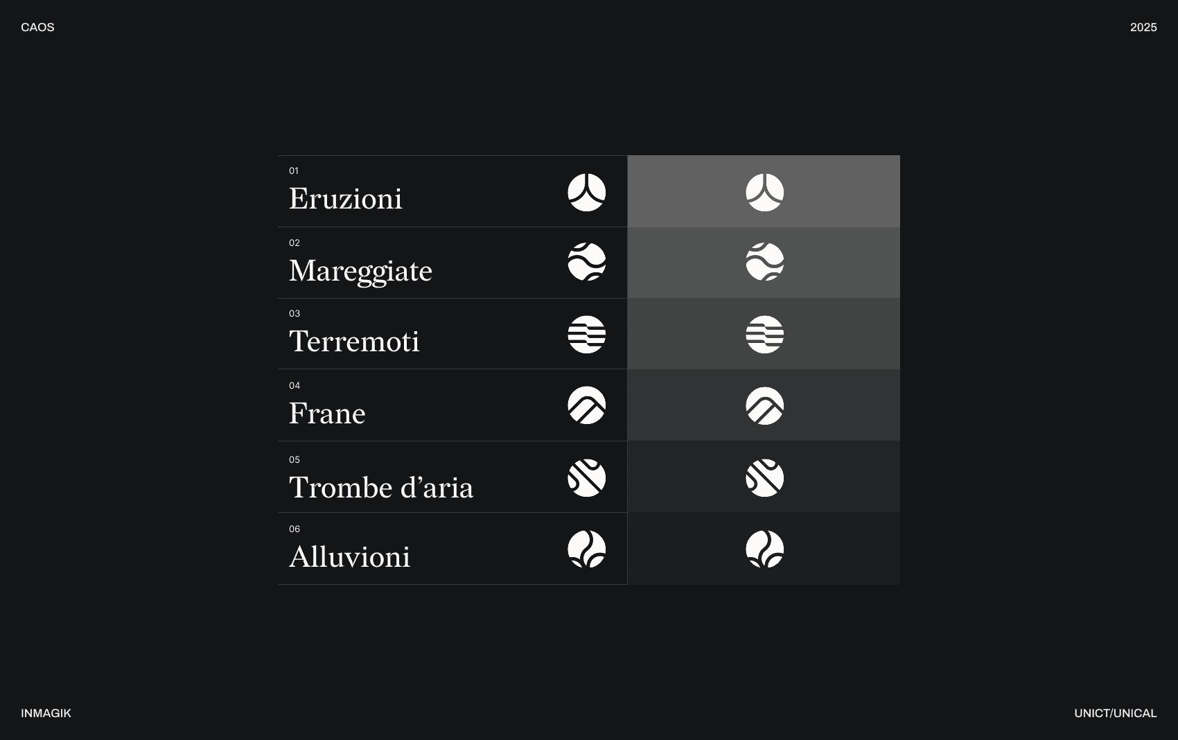
I had also explored the same illustrated direction in the second proposal presented to the client, which was ultimately discarded.
In this case, I based the system on forms constructed within a circle, resulting in a much softer visual language than the one eventually chosen.
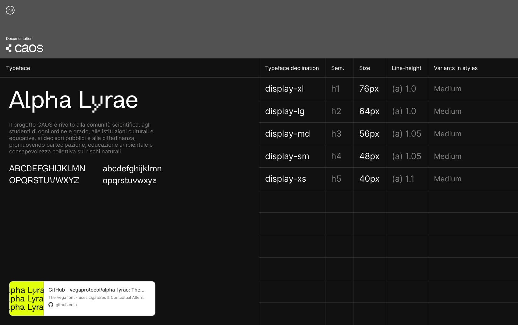
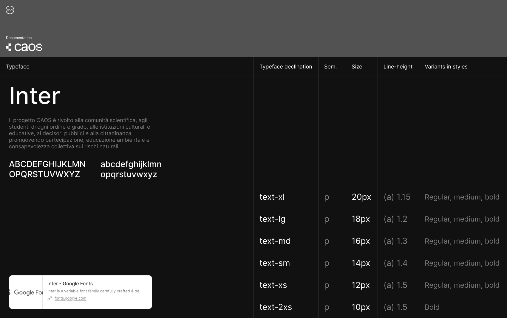
For the headings, I chose a typeface that strongly supported the visual language I was developing.
Alpha Lyrae, besides fitting well with the squared aesthetic, features numerous ligature sets that alter the letterforms in an almost “random” way, unexpectedly changing the appearance of the word being set.
To me, this reinforces the idea of a natural phenomenon that can sometimes be unpredictable.
FI / Visual system
For the visual system of Fototesti, I had much less time, which is why I did not present two different proposals. I chose to maintain a dual typographic style, combining serif and sans-serif typefaces to bridge modernity with the more traditional world of books.
I also introduced the circle into the geometric language, evoking a camera lens, and built part of the visual system around it.
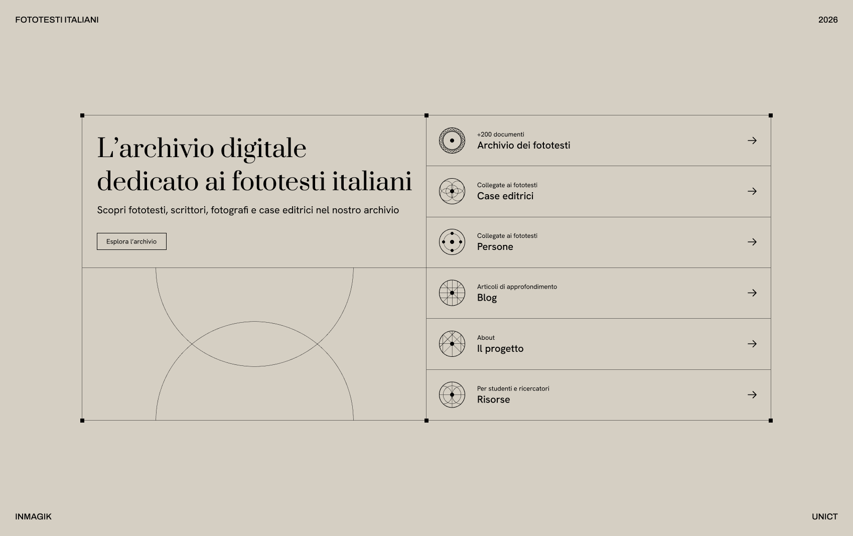
I created a set of icons, maintaining as much consistency as possible across the different sections of the site.
I kept the visual language abstract while ensuring that each icon had a clear rationale and connection to the category it represented.
Later, during the UI design phase, I animated them to introduce subtle micro-interactions.
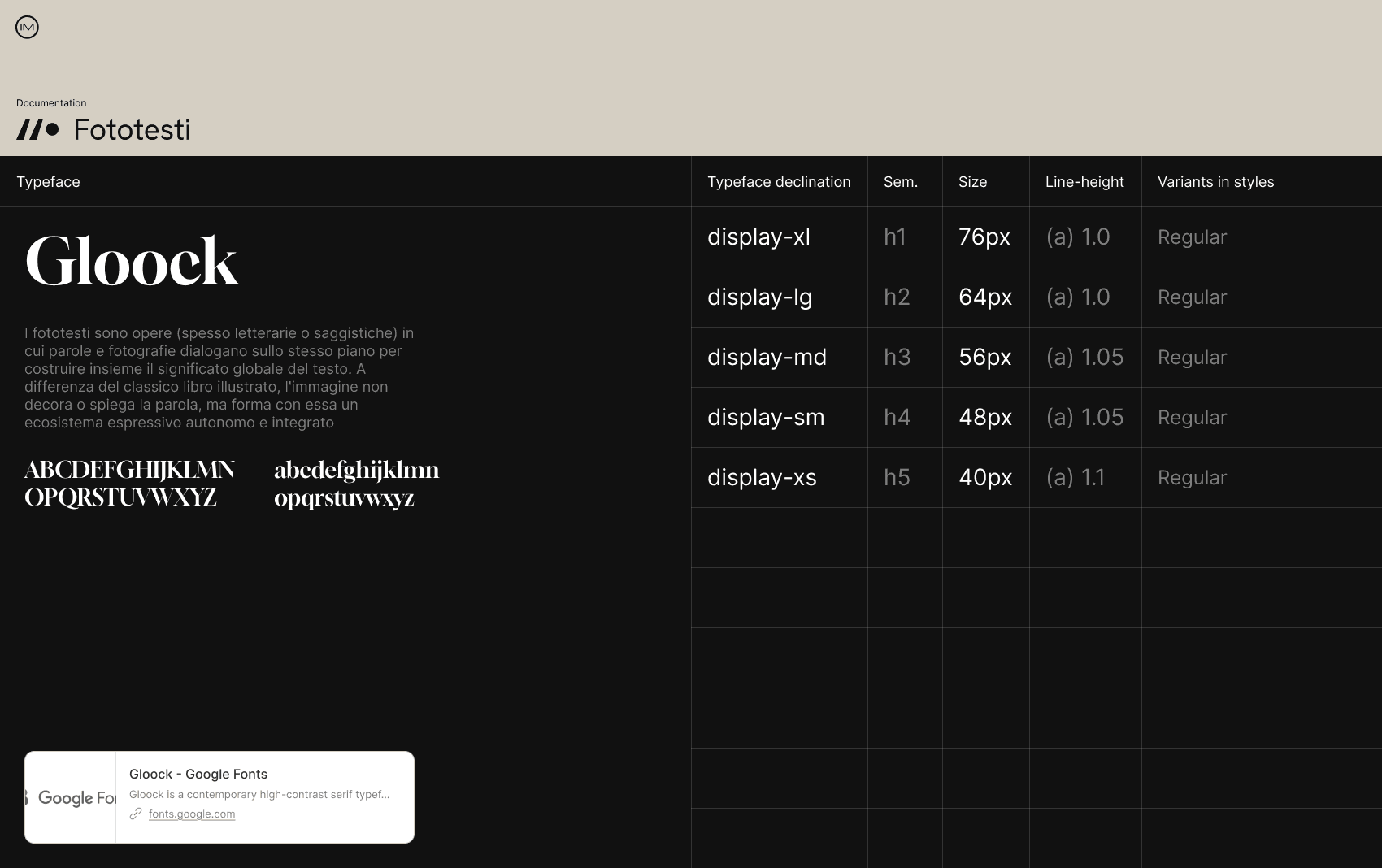
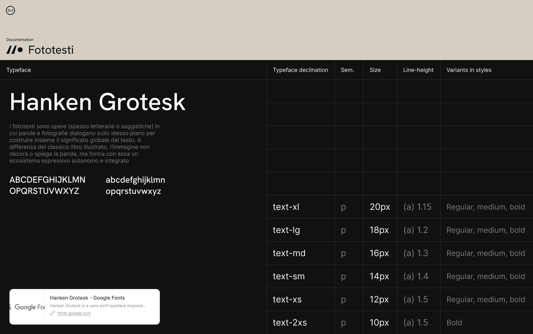
For the display typeface, I chose Gloock to create high-impact headings at large sizes, with a serif character that references the world of books.
For body text, I opted for Hanken Grotesk, as it remains highly legible at smaller sizes, which was particularly important given the long metadata fields that needed to be displayed.
BSD / UI Components
The Berlinguer e il Sud Globale site’s UI components focused primarily on the search bar, filters, and other navigation elements for browsing through the various documents.
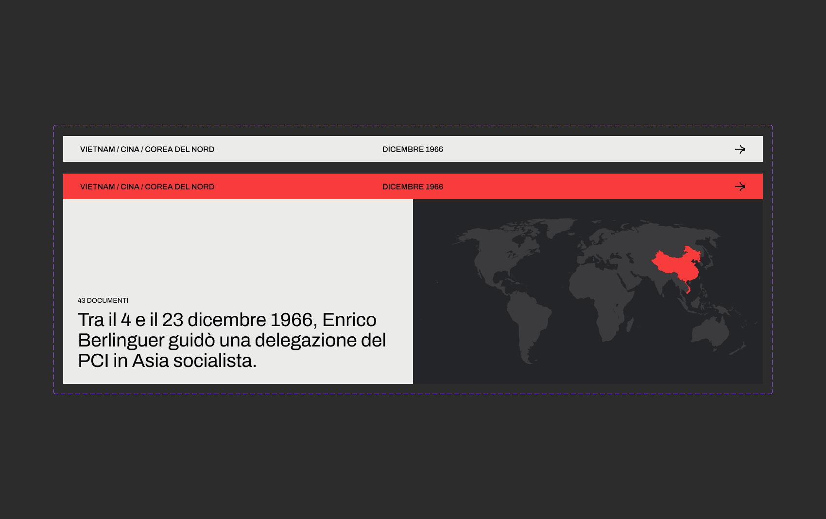
The platform strongly integrated the spatial dimension with the temporal one, placing particular emphasis on the countries mentioned.
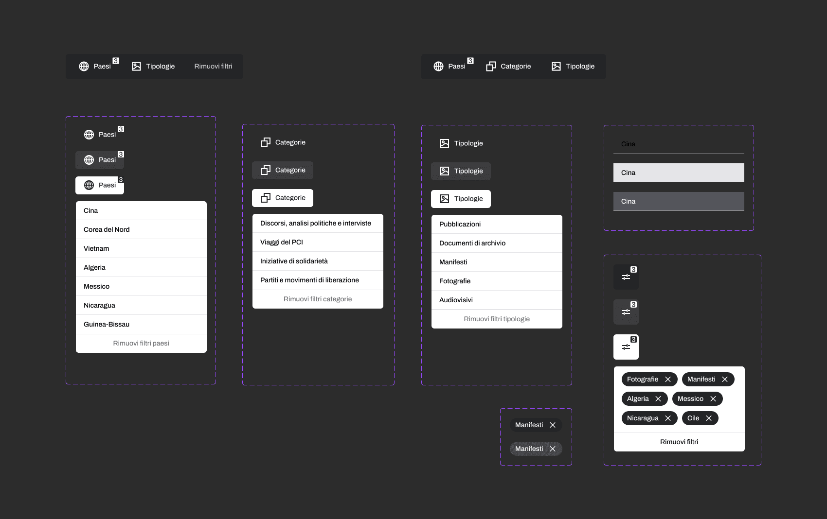
I kept the filter bar as compact as possible, allowing users to have a broader view of the content.
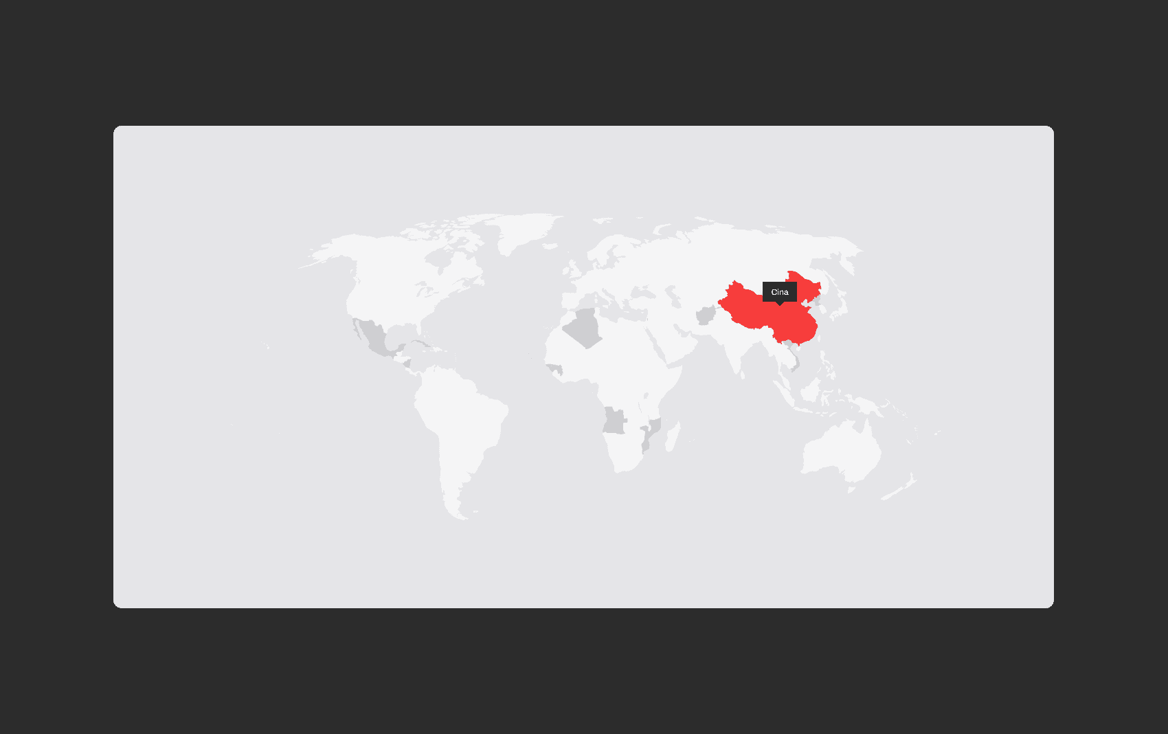
Within the spatial dimension of the map, I differentiated between countries containing documents from specific categories and those containing other types of documents.
CAOS / UI Components
In CAOS, I placed a strong emphasis on visually differentiating each element, making the various phenomena immediately recognisable.
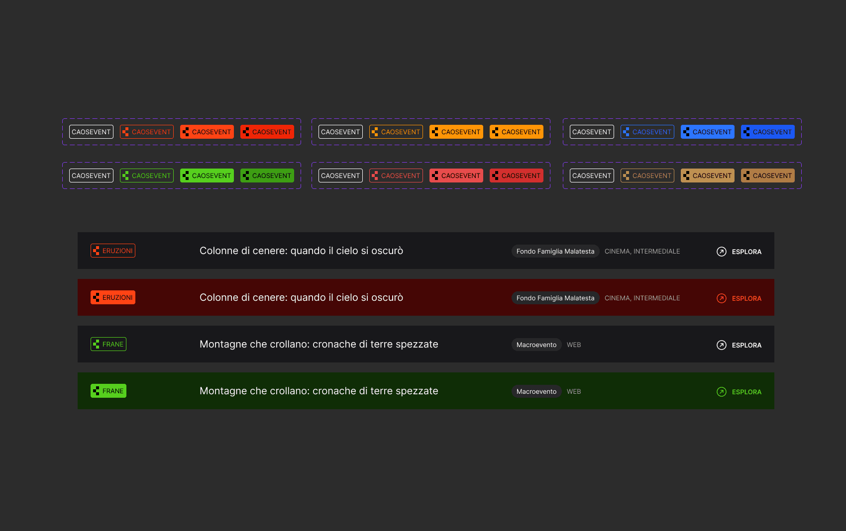
Each document record includes a tag that allows users to immediately identify the related phenomenon.
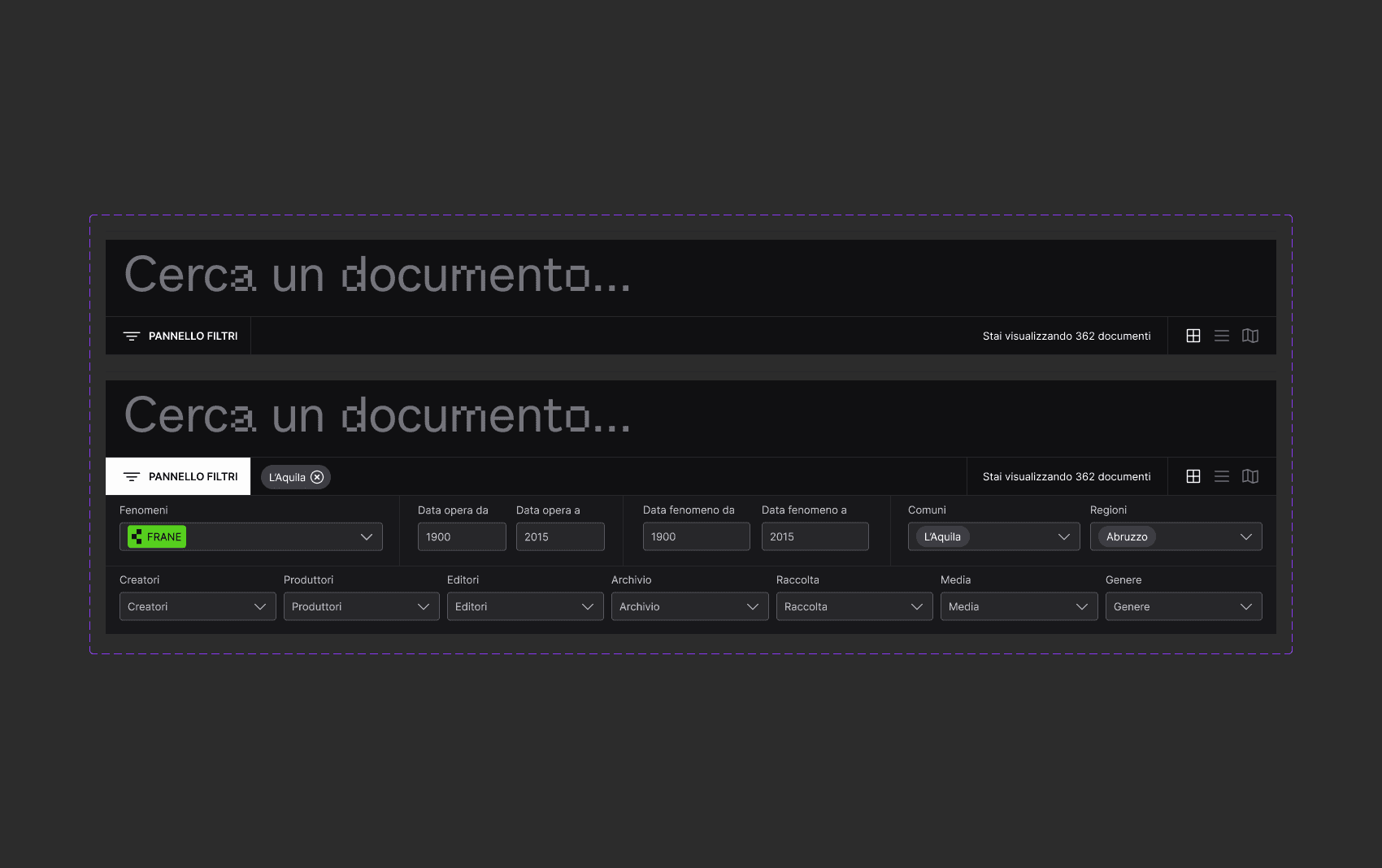
The search and applied filters were condensed into a single dropdown connected to the search bar, keeping advanced search options readily available when needed.
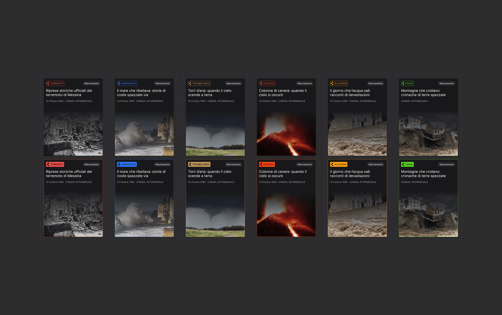
Each phenomenon card, which links to its detail page, features a cover image with a subtle gradient that blends into the card, avoiding any harsh visual separation.
FI / UI Components
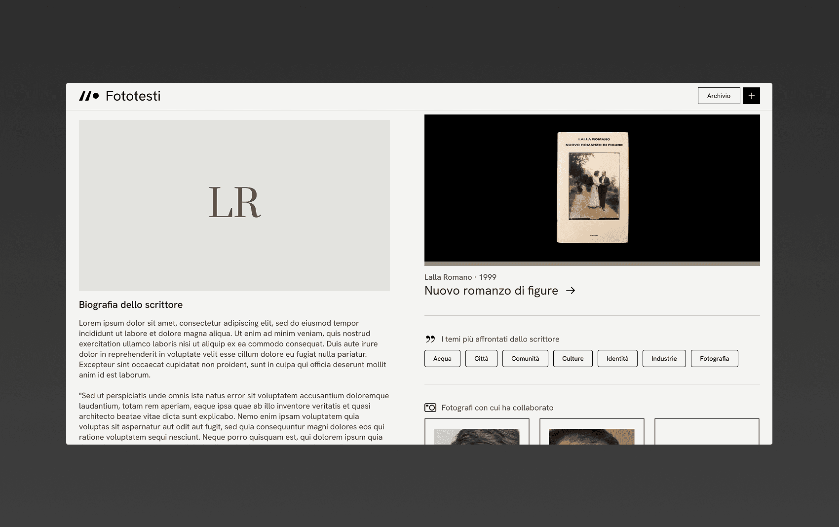
For Fototesti, I opted for a simple UI, using geometric elements throughout the cards and adding subtle micro-interactions on hover.
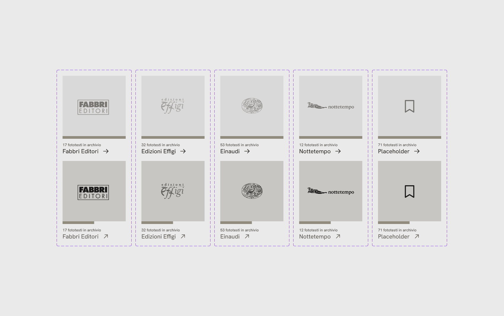
The publisher cards were designed following the same visual language established for the people and phototext cards.
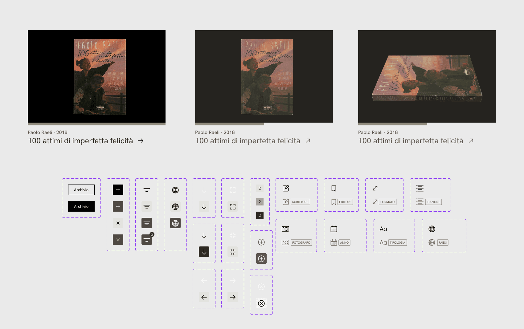
I assigned icons from the Lucide icon pack to each metadata field to improve readability.
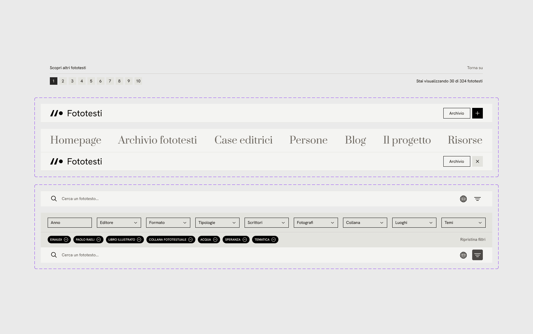
The search bar is placed at the bottom of the page on both desktop and mobile, giving more space to showcase the extensive photographic work behind the phototexts.
Outcome
The three final outcomes were the result of several months of work. As mentioned at the beginning, I chose to present them together on this case study page because, despite their differences, I believe they share the same purpose: the dissemination and/or preservation of culture.
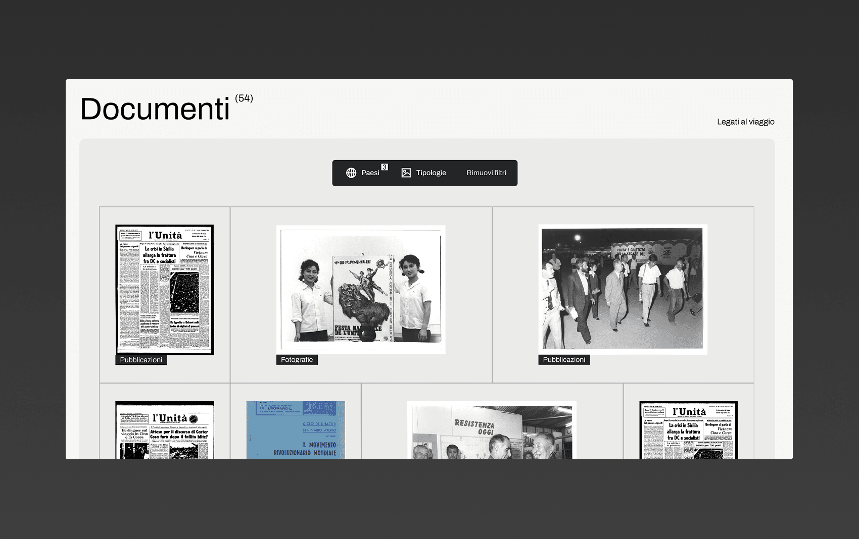
The final result is three interactive digital archives that can be easily explored by anyone. They act as visual narratives through the UI design, while also providing a simplified UX focused on making documents easy to view and navigate between.
Final thoughts
Each of these archives presented a different challenge, both in terms of UI and visual narrative. From a UX perspective, the most difficult part was making each archive as accessible and easy to explore as possible, even for users who had no prior knowledge of its subject matter.
This project taught me that, while the value of a document lies in the content itself, the experience surrounding it can also tell a story that enhances its value, making the process of exploring and engaging with it more enjoyable.
What we built
What changed
Personal learnings