UX/UI DESIGN & VISUAL
A digital tool for exploring relationships across 20,000+ cultural entities, designed for researchers, professors, and students.
INDUSTRY
EDUCATION
YEAR
2025
TEAM
4 PEOPLE
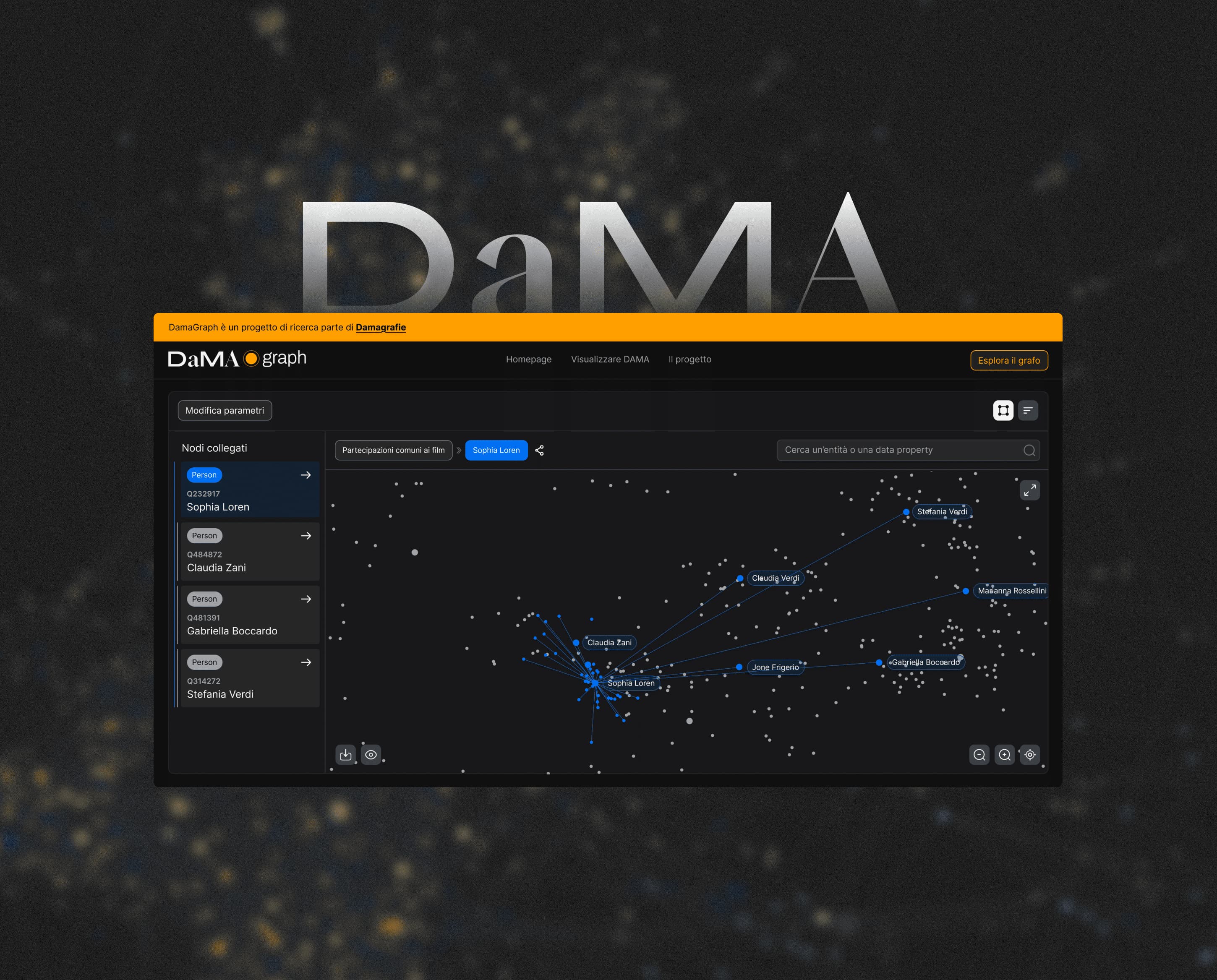


Introduction
The DAMA project was first launched in 2017 with the goal of highlighting, promoting, and preserving works and themes created by predominantly Italian female authors, writers, and actresses from the 20th century to the present day.
In 2025, the project was expanded, and the work presented on this page covers what I designed and developed as part of this extension.
The main goal was to make the connections between these actresses, writers, and their themes as intuitive as possible, bringing to light the potentially hidden relationships between these elements and showing how they intertwine throughout each woman’s life.
The underlying dataset contains more than 20,000 interconnected entities, including films, directors, actors, writers, keywords, and other cultural references. The challenge was to turn this complex structure into an accessible experience for students, professors, and researchers, without requiring any technical knowledge of RDF or knowledge graphs.
Overview
Project Goal
Platform
Timeframe
Team composition
Purpose of the tool
Dama was designed to make hidden relationships within the dataset easier to discover and explore.
For example, users can uncover connections between actresses who worked across the same films, genres, or directors — relationships that would otherwise be difficult to identify manually.
The challenge was to turn a complex network of interconnected entities into an accessible experience for research and exploration, without requiring users to understand the technical structure behind the data.
Target audience
The tool is primarily designed for students, university professors, and researchers, enabling them to explore connections between multiple entities and support their research with objective, data-driven evidence.
Persona
Persona
Persona
RDF Graph database
Before the initial discovery call, I was given access to the RDF graph database: a node-based database connecting the various entities, with around 20,000 entries spanning actresses, writers, directors, keywords, and more.
I decided to start by exploring the data model to build a clear understanding of the information that would eventually be integrated into the tool. I used Protégé to examine its structure and relationships, helping me better understand the dataset I would be working with.
The design challenge was not to reduce this complexity, but to make it navigable.
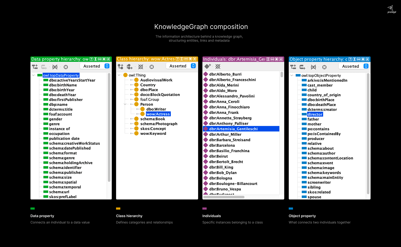
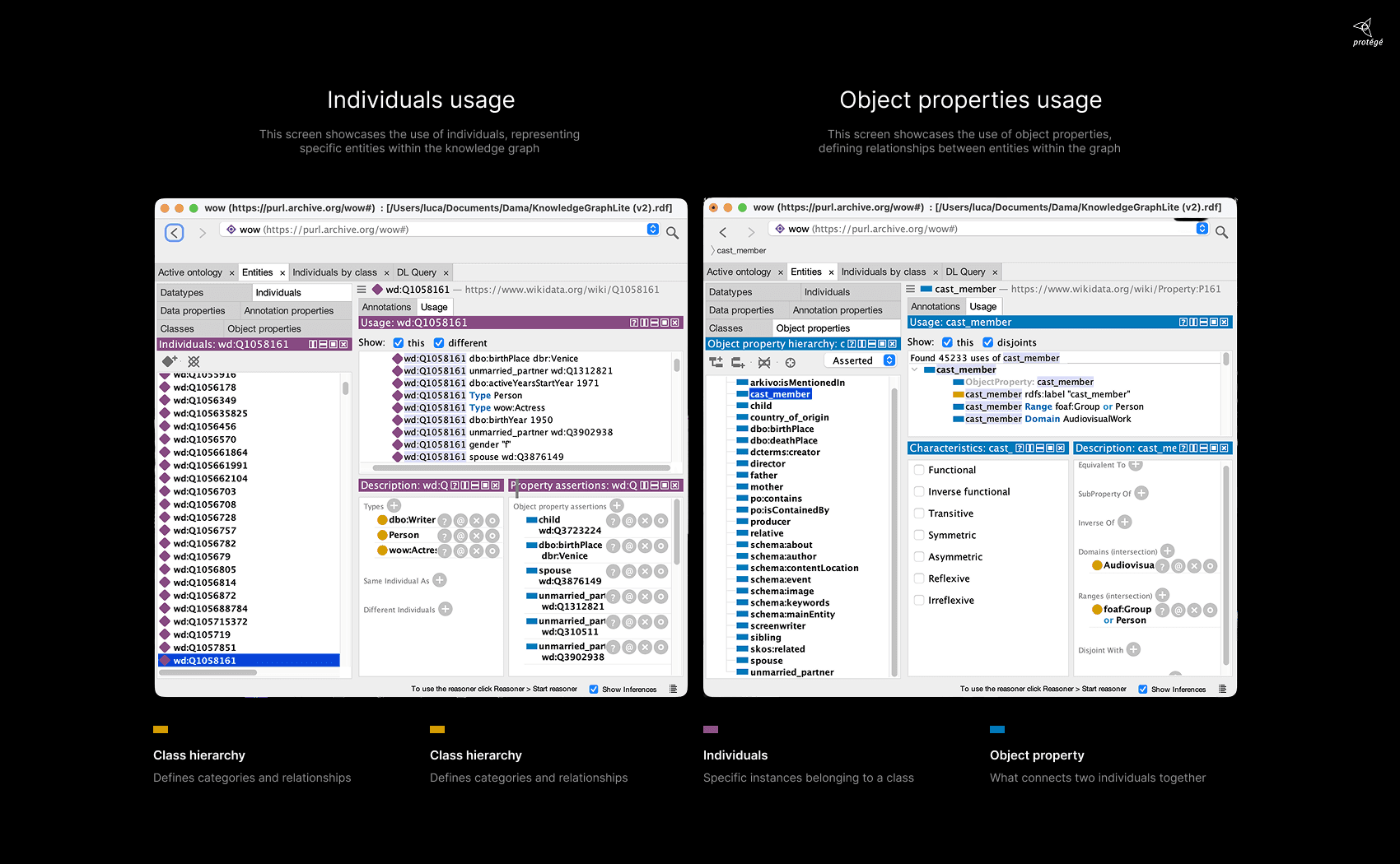
I used some of these slides after the kick-off phase with the client to make the structure easier to understand.
Discovery
At the beginning of the project, the main challenge was not simply to visualise the knowledge graph, but to make its complexity useful for research and exploration.
Early discussions with the client highlighted three key areas to investigate: how entities should be categorised, how relationships and data sources should be exposed, and how to prevent the graph from becoming overwhelming.
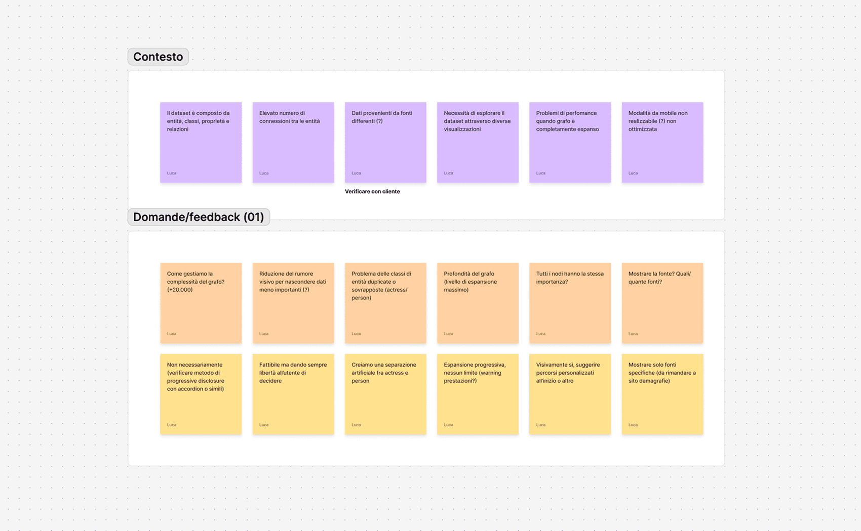
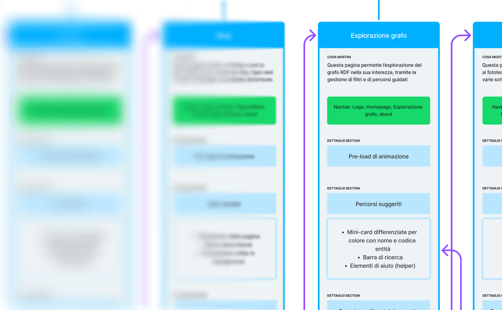
These two images show some of the questions and answers gathered from the client, along with an initial foundation for the UX architecture.
UX and UI research
I reviewed existing graph visualisation and research tools to understand how they handled entity categorisation, navigation, filtering, and information density.
One principle quickly emerged: users should be able to progressively reveal the complexity of the graph rather than being exposed to the entire network at once.
This informed the way navigation, filtering, and graph expansion were later designed.
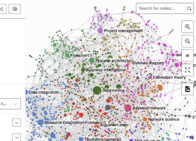
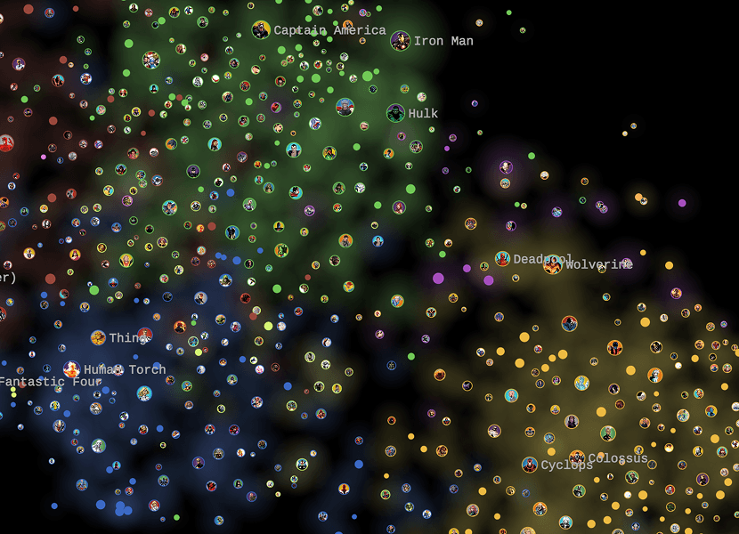
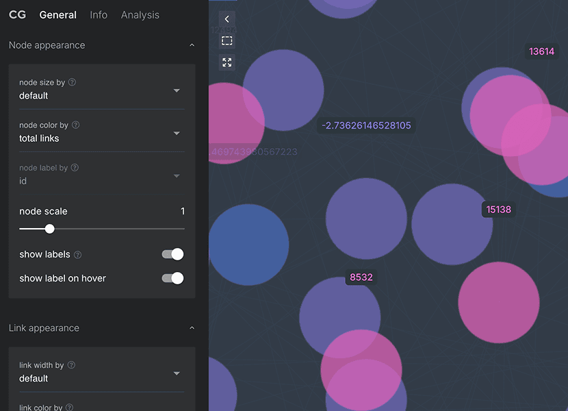
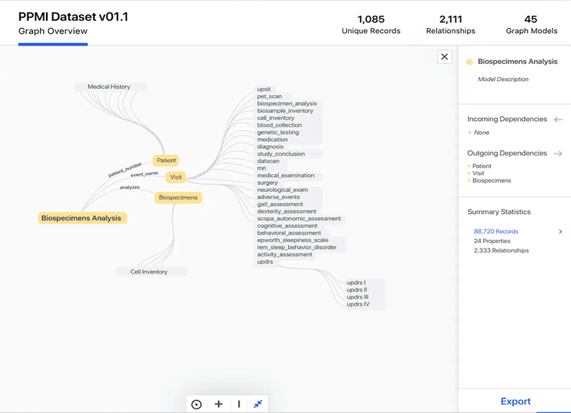
Existing tools expose too much information and large graphs become difficult to read.
Key finding
Users need to understand what an entity represents before exploring its relationships.
Key finding
Exposing the entire graph at once makes exploration difficult and visually overwhelming.
Key finding
Connections become meaningful when users can understand the entities behind them.
Technical constraints
Before starting the wireframing phase, I discussed the findings with the developers. We decided to use Sigma.js as the rendering engine, as it is open-source, highly optimized, and highly customizable.
I then worked closely with the development team to understand what was feasible from both a UX and UI perspective with the chosen engine, and whether certain solutions could be implemented as envisioned or needed to be rethought entirely.
Design idea
Gradually expand the graph
Constraint
Performance reduction
Solution adopted
Limit graph expansion
Design idea
Temporarily hide one or more entities
Constraint
Sigma.js doesn't allow single entities hide
Solution adopted
The user can hide entities categories
One idea that was ultimately discarded was the possibility of offering a 3D visualization of the graph. We chose to work exclusively in 2D, which was also one of the reasons behind the initial decision to use Sigma.js.
Although a 3D visualization would have had a stronger visual impact, it would have introduced significant UX and performance issues, especially on certain devices. In some cases, this could have resulted in a frustrating experience or even made the tool completely unusable.
Design system
After creating a general wireframe and getting the client’s approval, I started building a small design system covering all the components I needed.
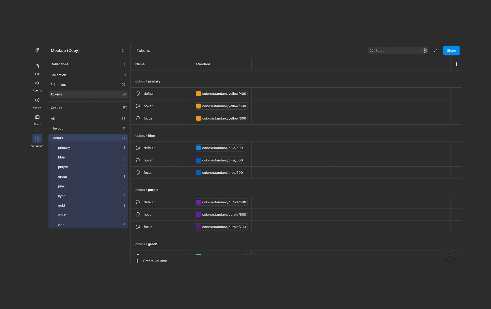
The idea was to assign a distinct color to each entity, while intentionally using the same color for one specific entity, bookQuotation, and the primary brand color. This creates a clear visual language where each entity can be recognized at a glance.
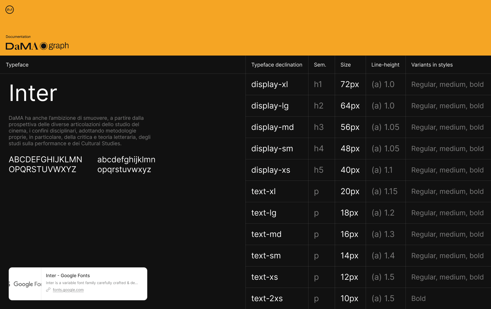
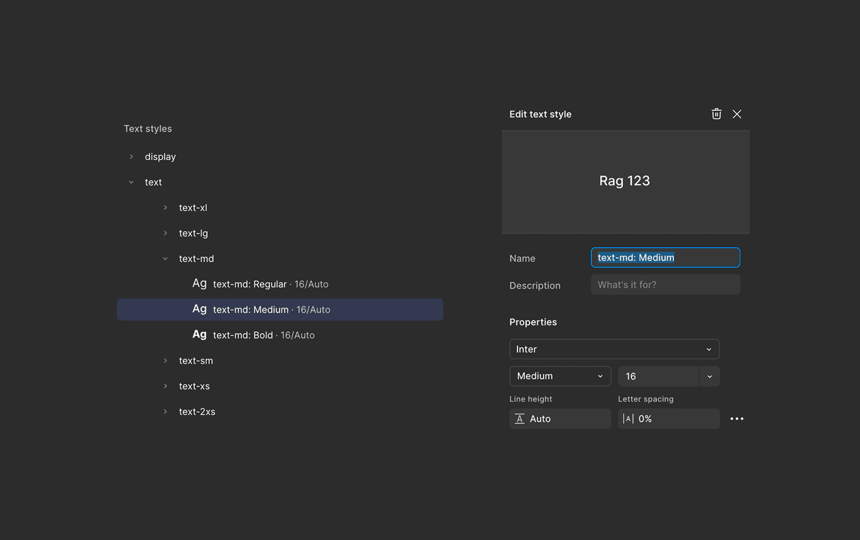
Inter was chosen for its neutrality and legibility across the interface.
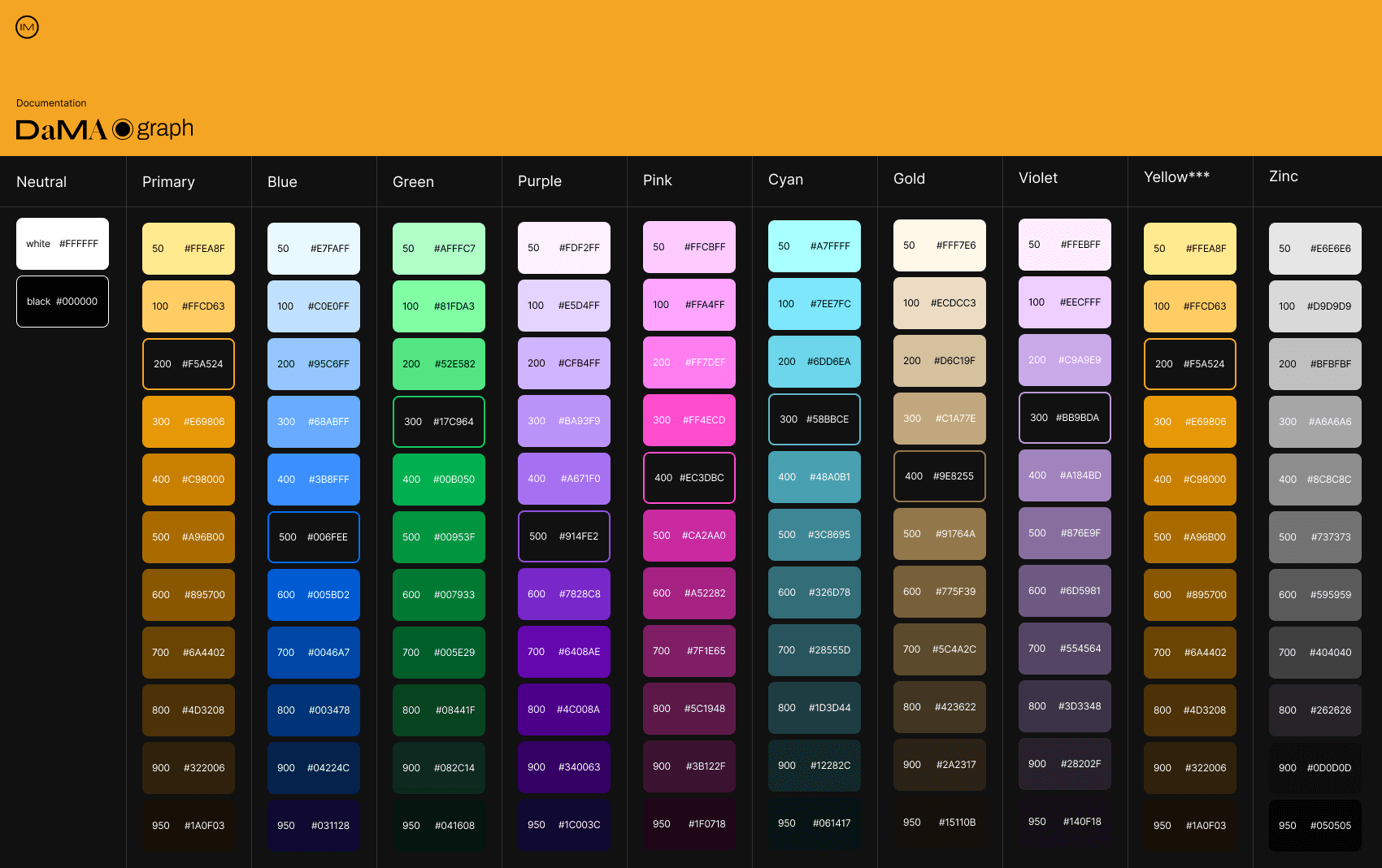
Each entity type was assigned a distinct colour, allowing users to identify relationships directly within the graph without relying exclusively on labels.
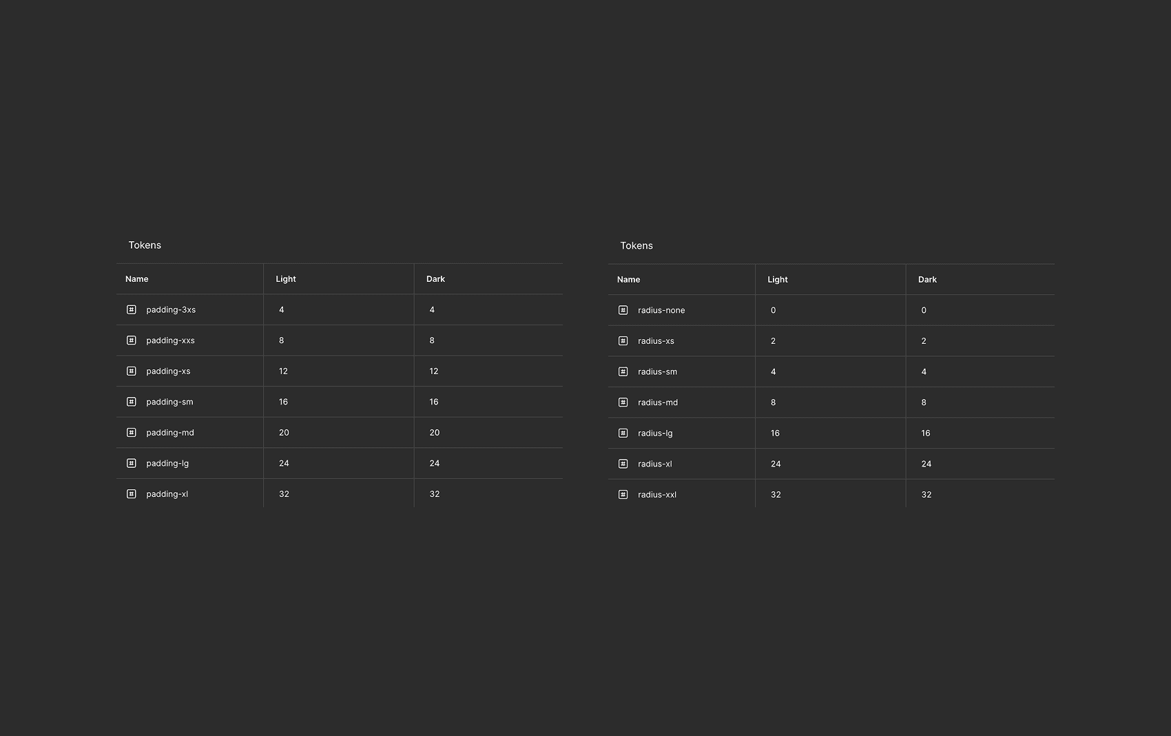
I defined radius and padding tokens, keeping the design system intentionally lightweight and avoiding unnecessary complexity.
UI components
After defining the visual guidelines, I started building the high-fidelity mockup, creating a range of custom components based on the visual rules I had established.
Some components were later discarded, simplified, or adapted to better fit the overall experience.
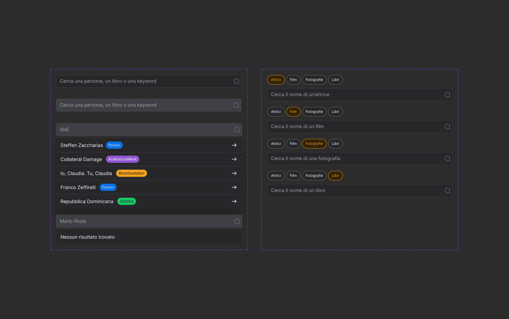
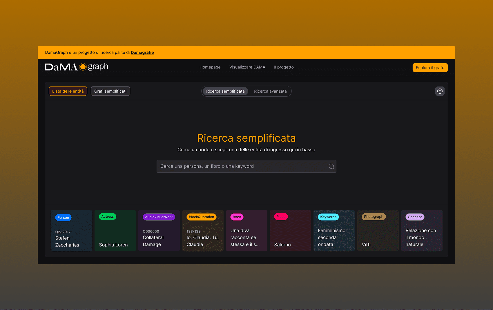
The navigation anticipates the entities present and their types based on what is being typed.
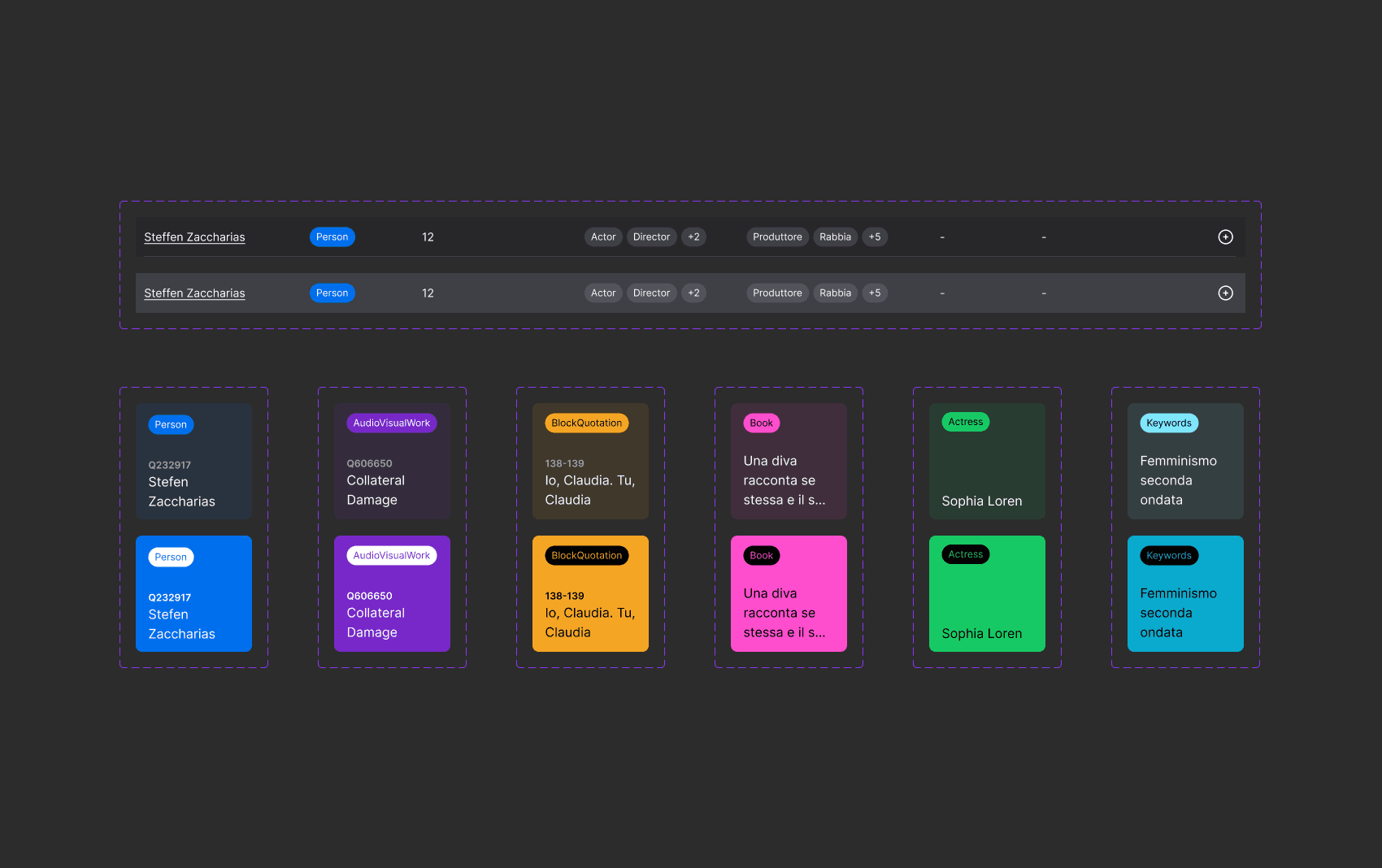
In simplified search mode, cards are provided as suggested paths to help users start exploring.
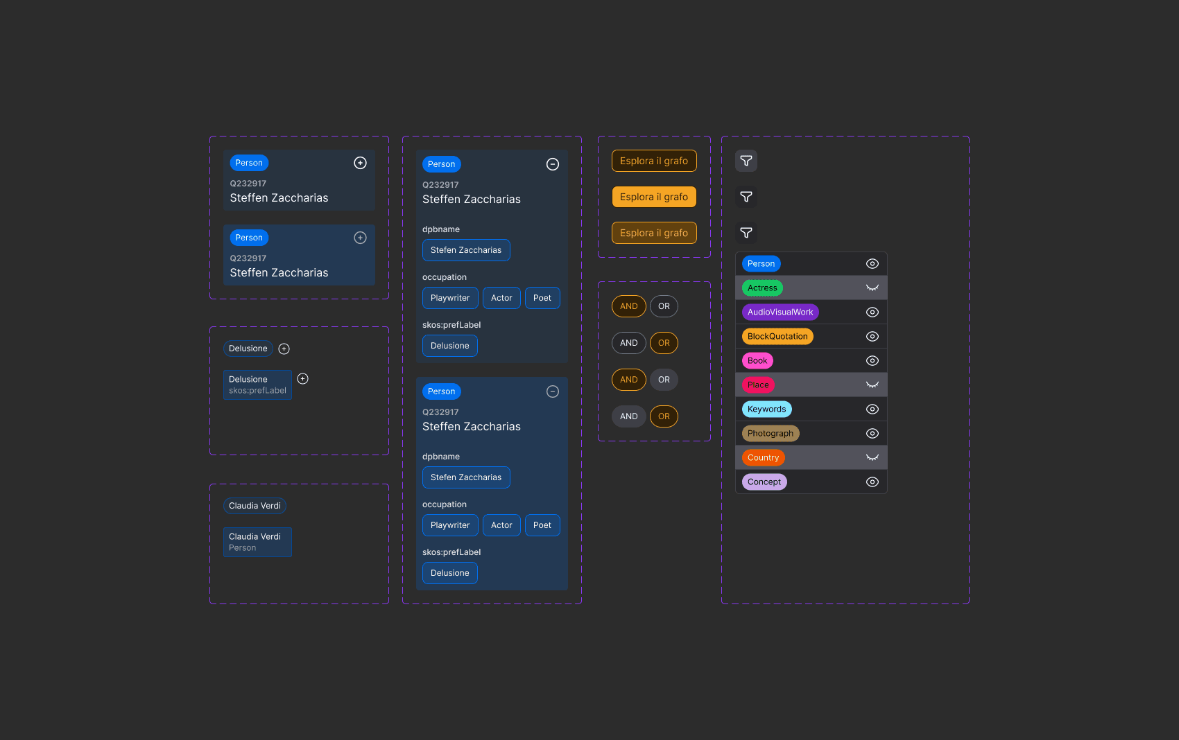
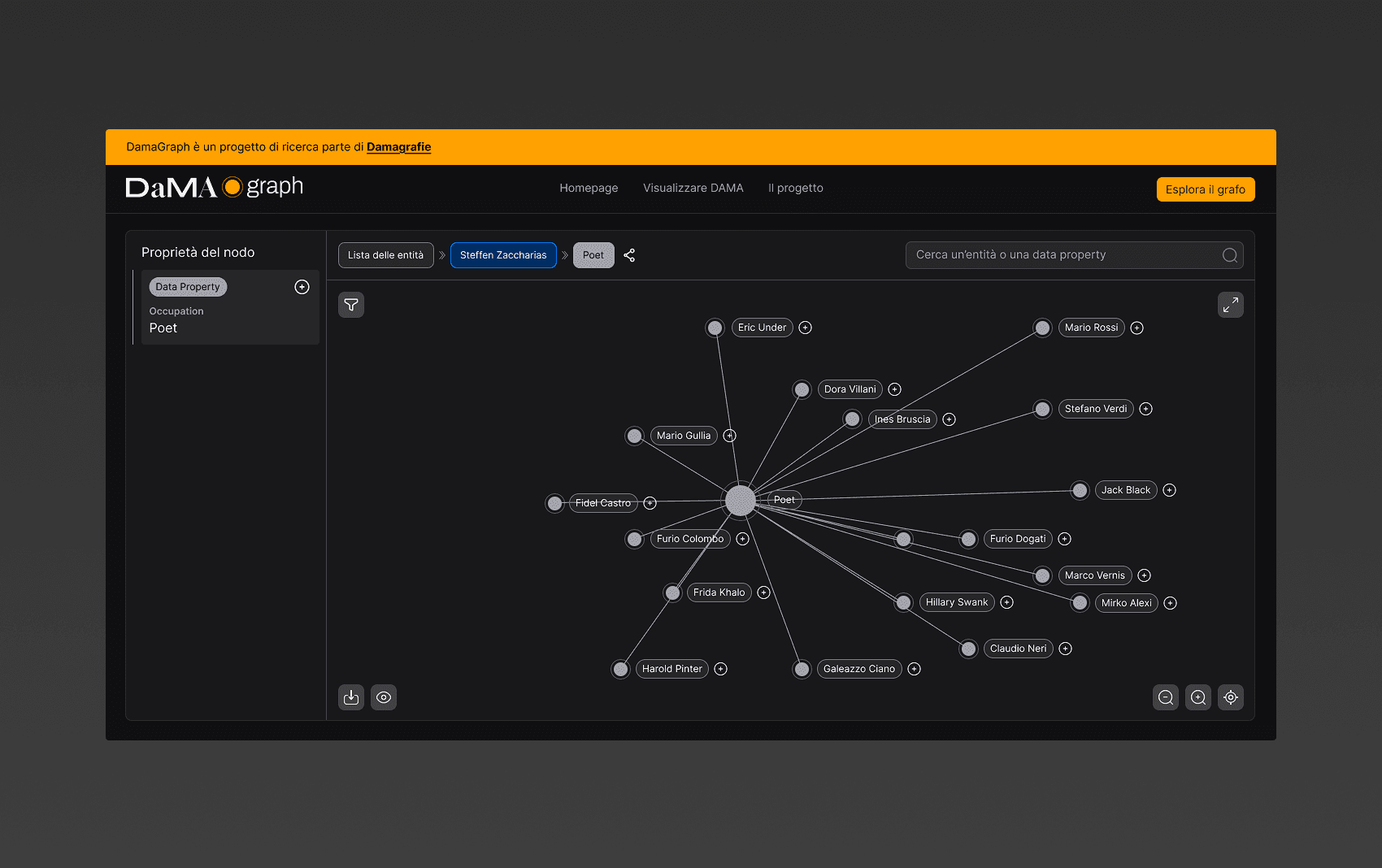
On the detail page for an individual node, additional information can be accessed on the same screen.
Outcome
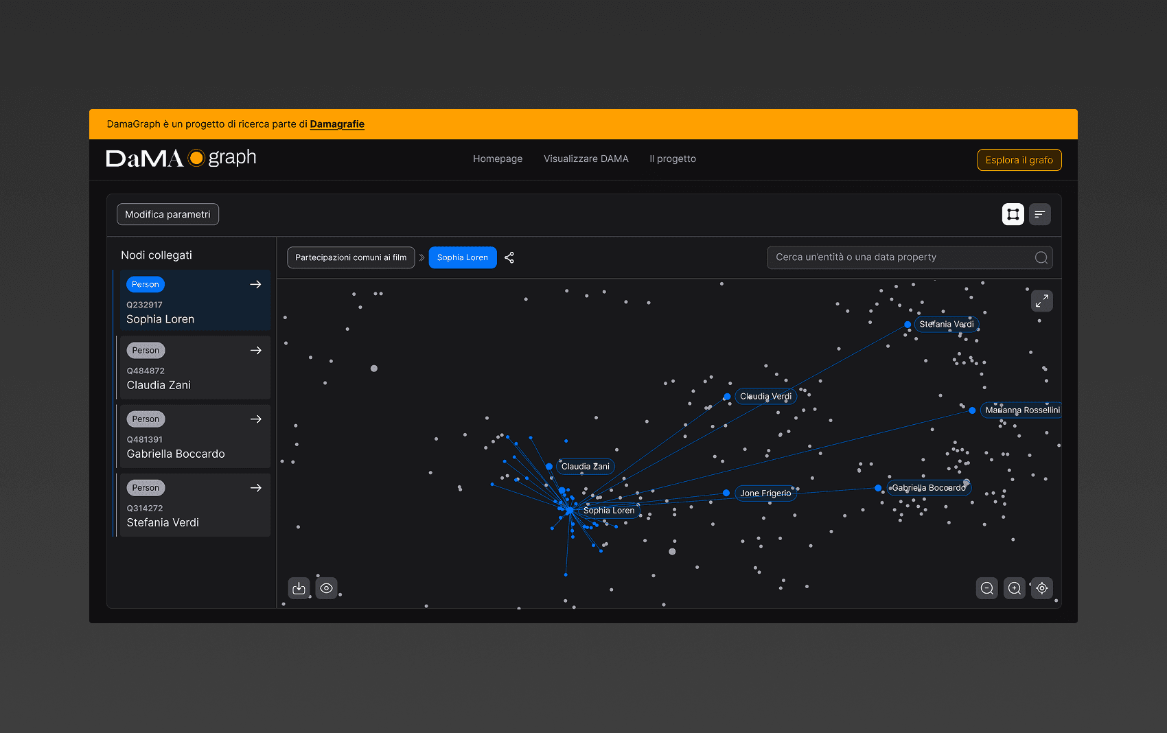
The final product transformed a complex RDF knowledge graph into an accessible visual exploration tool. By combining progressive graph navigation, clear entity categorisation, and contextual information, Dama makes relationships across more than 20,000 cultural entities easier to discover and understand.
The result is a research-oriented interface that bridges the gap between the complexity of the underlying data and the needs of non-technical users, allowing students, researchers, and professors to explore connections without relying on specialised tools.
Final thoughts
DAMA's main challenge was turning a complex network of more than 20,000 entities into something people could explore intuitively. The final product bridges the gap between the complexity of the underlying data and the needs of non-technical users.
The final result was particularly well received, and the platform is now available to researchers and students who want to use it.
From a personal perspective, the project was a valuable challenge: making a graph containing more than 20,000 entities accessible and easy to navigate for non-technical users, including those with limited familiarity with technology.
What we built
What changed
Personal learnings