BRAND IDENTITY & UX/UI DESIGN
INDUSTRY
BRANDING
YEAR
2026
TEAM
2 PEOPLE
Introduction
Inmagik is a software development company based in Bergamo, targeting primarily small and medium-sized Italian businesses, universities, and institutions.
The need that emerged was to completely revolutionize the company’s image, touching every physical and digital touchpoint within our scope, with the goal of completely modernizing the way we were perceived externally.
For this project, as the sole designer, I decided to pursue a complete rebranding in order to relaunch the company’s image and create a completely different perception: more modern, more up-to-date, and more in line with that of a well-established agency.
Overview
Project Goal
Platform
Timeframe
Team composition
1 PM, 1 designer
Rebranding need
I suggested completely transforming the company’s image because I felt that my colleagues’ strong technical expertise and knowledge of our stack were not being fully expressed through our website, social media, and, above all, our existing visual identity.
The goal was therefore to bring our talent to the forefront, so that it would no longer remain hidden but become clearly perceivable from the outside.
Inmagik's target
The only thing that perhaps didn’t change was our target audience. From a business perspective, we already knew exactly who we were targeting, so we decided not to deviate from this positioning.
Company target
Company target
Company target
The starting point
To start, I gathered everything we had: both the physical touchpoints, such as the letterhead, and every individual UI and branding element that represented us—from typography to color—all primarily focused on our main touchpoint: the website.
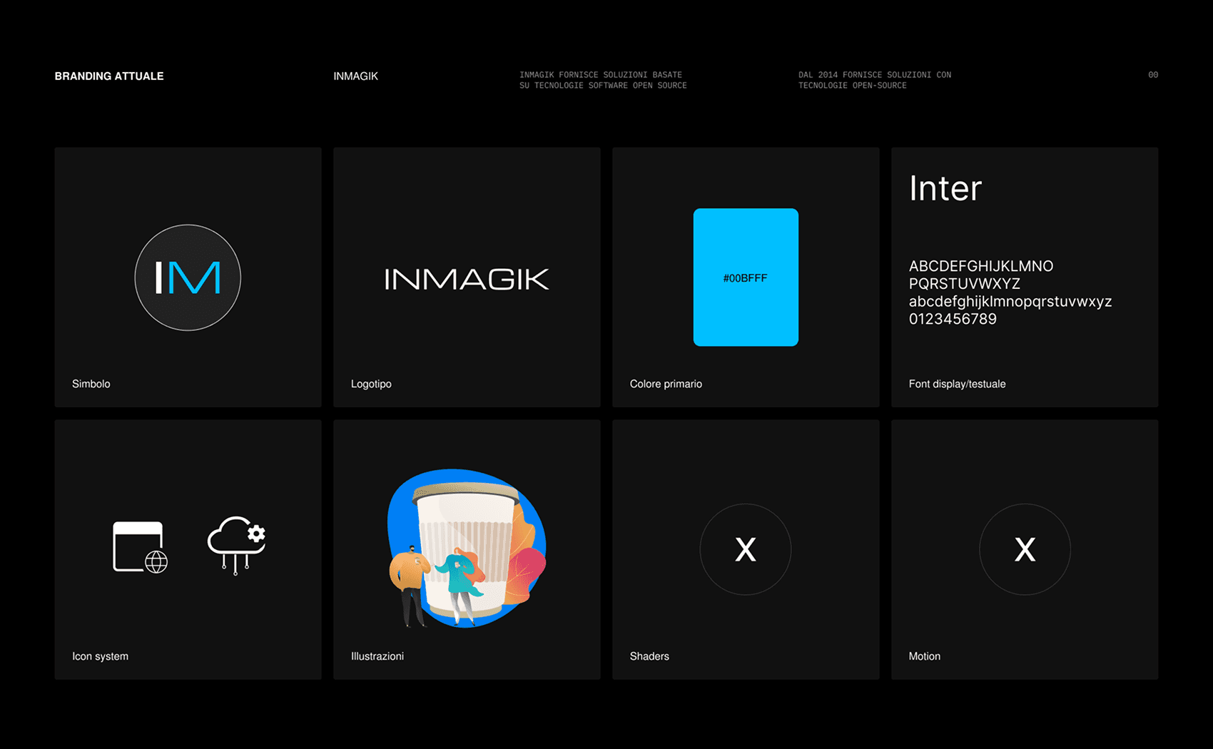
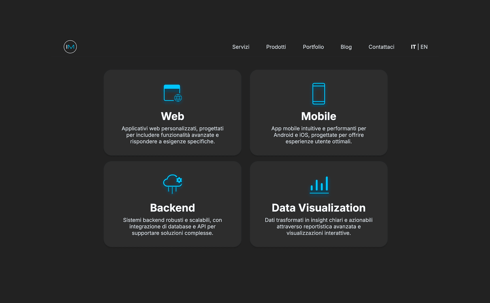
Screenshot taken from the current version of the website (as of August 2026).
Problem to solve
General
No physical branding touchpoints
Problem to solve
Website
Inconsistent use of UI elements
Problem to solve
Website
"Abandoned" website sections
Problem to solve
Website
Inconsistent icon system on website
Problem to solve
Social media
Limited social media presence
Problem to solve
General
No branding guidelines or brand manual
Research phase
Immediately after analyzing everything we had in terms of our company image, I began a twofold research process: identifying our competitors or completely different companies to understand how they positioned themselves in terms of business, information architecture, and messaging, while also examining the aesthetics they adopted—whether they leaned more toward experimentation or were more focused on precise conversion for specific target audiences.
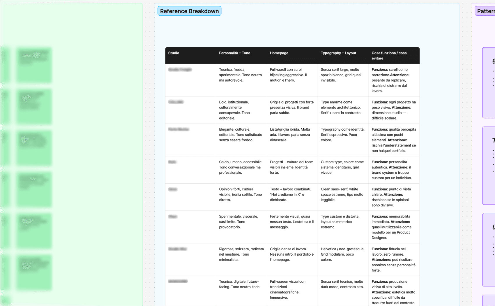
I selected several competitors as well as companies from completely different industries, then used AI to highlight their strengths, weaknesses, opportunities, and potential.
Roadmap & Deliverables
Once I understood what other competitors and companies were doing, I laid out a roadmap and a list of everything I needed to work on, covering both physical and digital touchpoints.
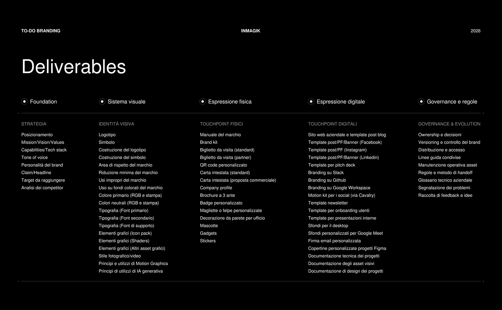
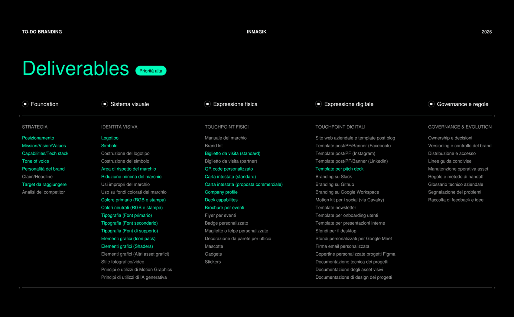
I assigned a priority level (high, medium, or low) to each touchpoint to establish an order and determine where I should start.
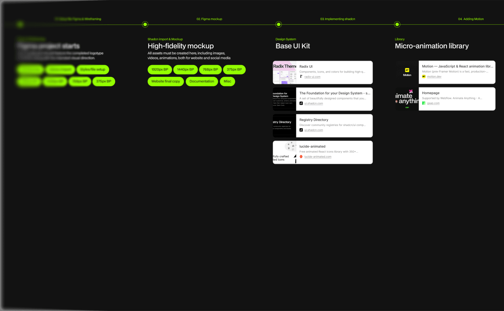
The new direction
From a visual perspective, the idea was to create an extremely modern aesthetic, with our main touchpoint—the website—serving as the cornerstone of our new visual identity.
Value 01
Inmagik is
Innovative
Value 03
Inmagik is
Modern and flexible
Value 02
Inmagik is
Reliable
Value 04
Inmagik is
Human-centered
Renewed branding
After defining the visual guidelines, I started building the high-fidelity mockup, creating a range of custom components based on the visual rules I had established.
Some components were later discarded, simplified, or adapted to better fit the overall experience.
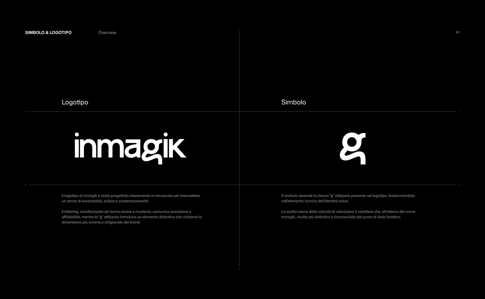
The Inmagik symbol thus becomes the “g” within its logotype, using a more stylized and “human” typeface.
This creates a contrast between the company’s human, handcrafted nature and the rigor and precision of a sans-serif typeface.
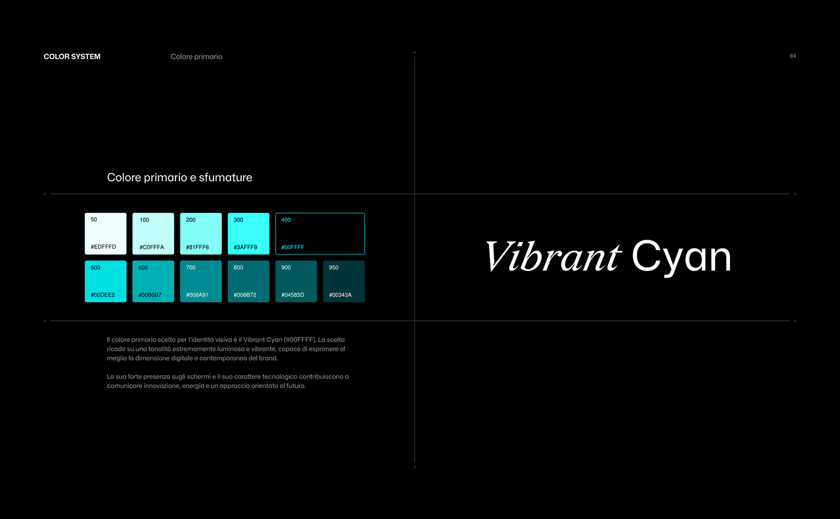
In addition to the neutral color palette, the primary color becomes a pure cyan, specifically designed for digital touchpoints. The choice was made in order to not divert too much from the existing color.
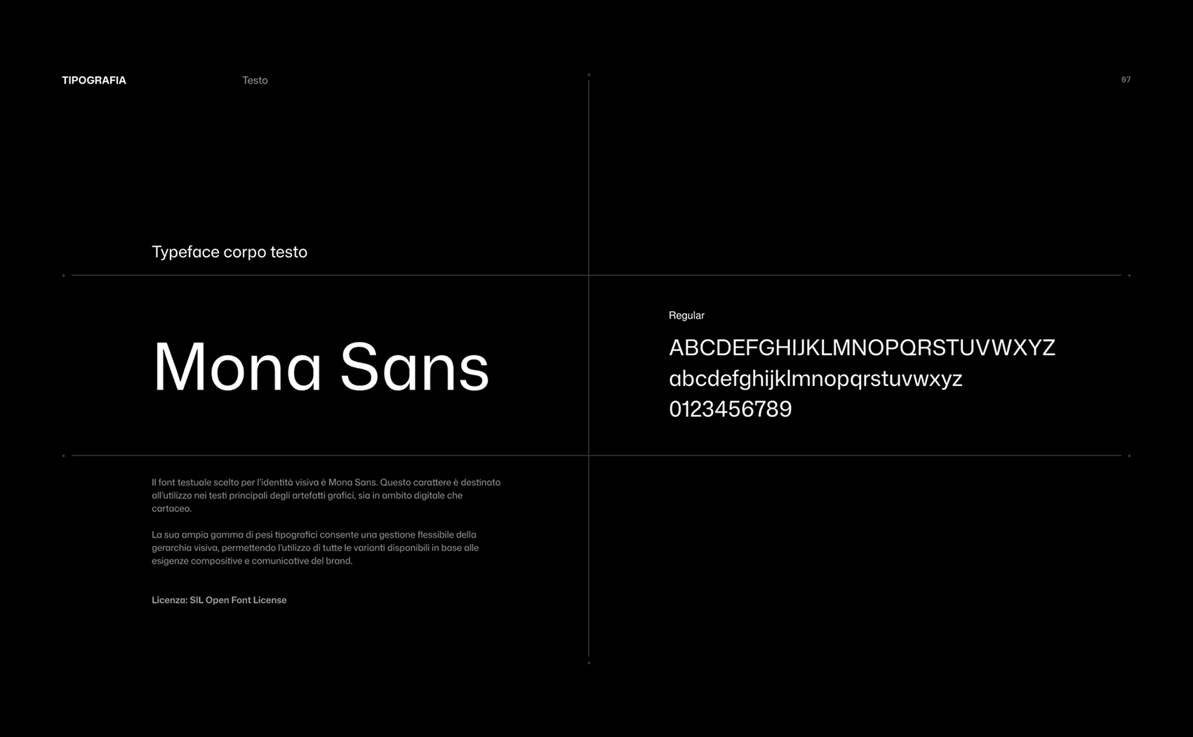
The primary typeface chosen is Mona Sans, for its aesthetic rigor, modern character, and versatility across different contexts and applications.
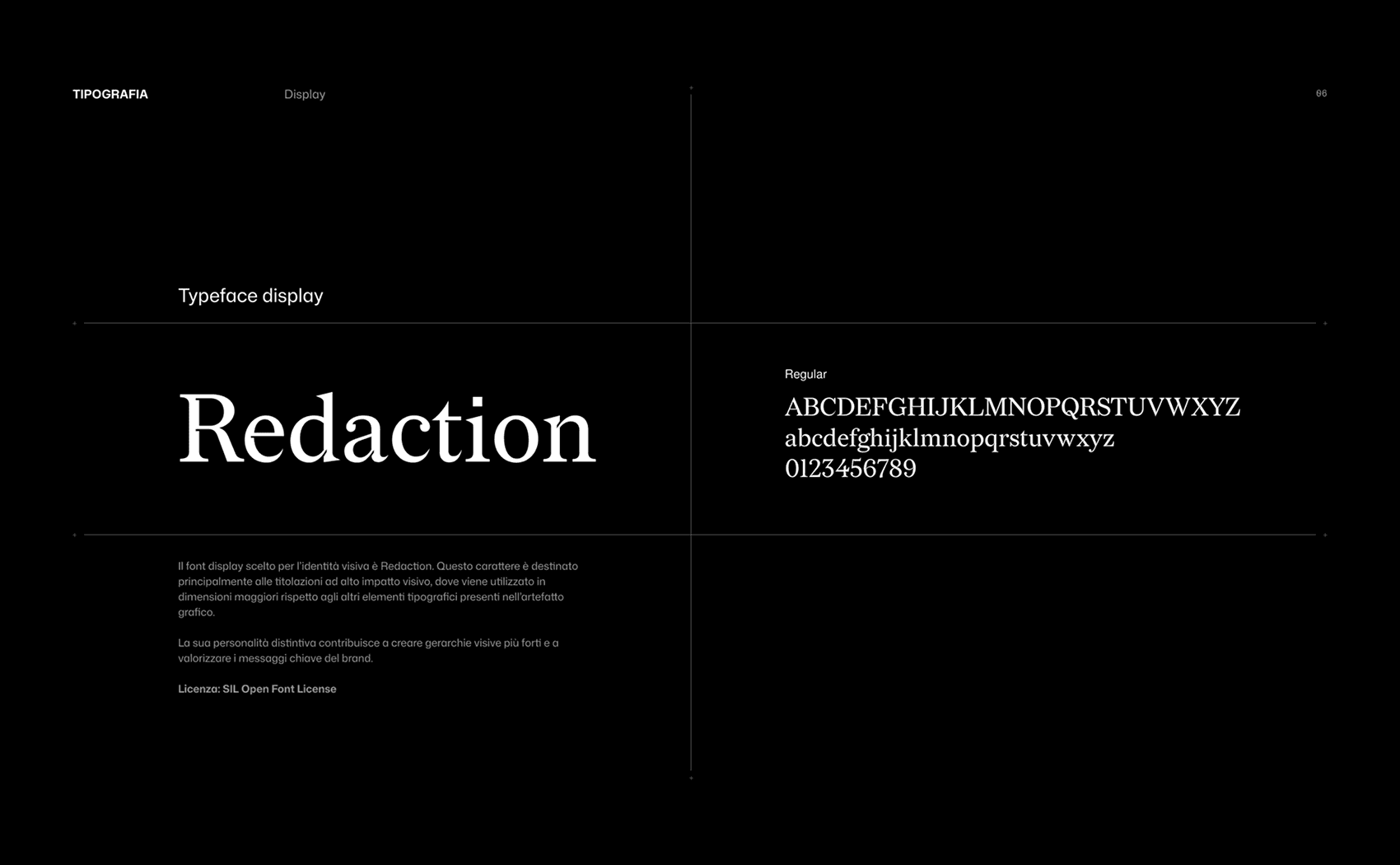
The display typeface chosen is Redaction, to emphasize the presence of Inmagik’s two distinct “souls.”
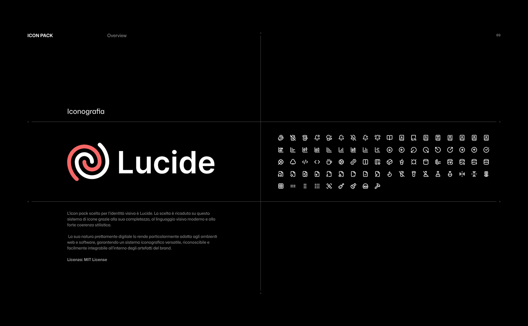
Having a standardized icon set will ensure consistency across all digital touchpoints.
Physical touchpoints
I started with two physical touchpoints, which in my opinion were the most important and most frequently used: the business card and the letterhead.
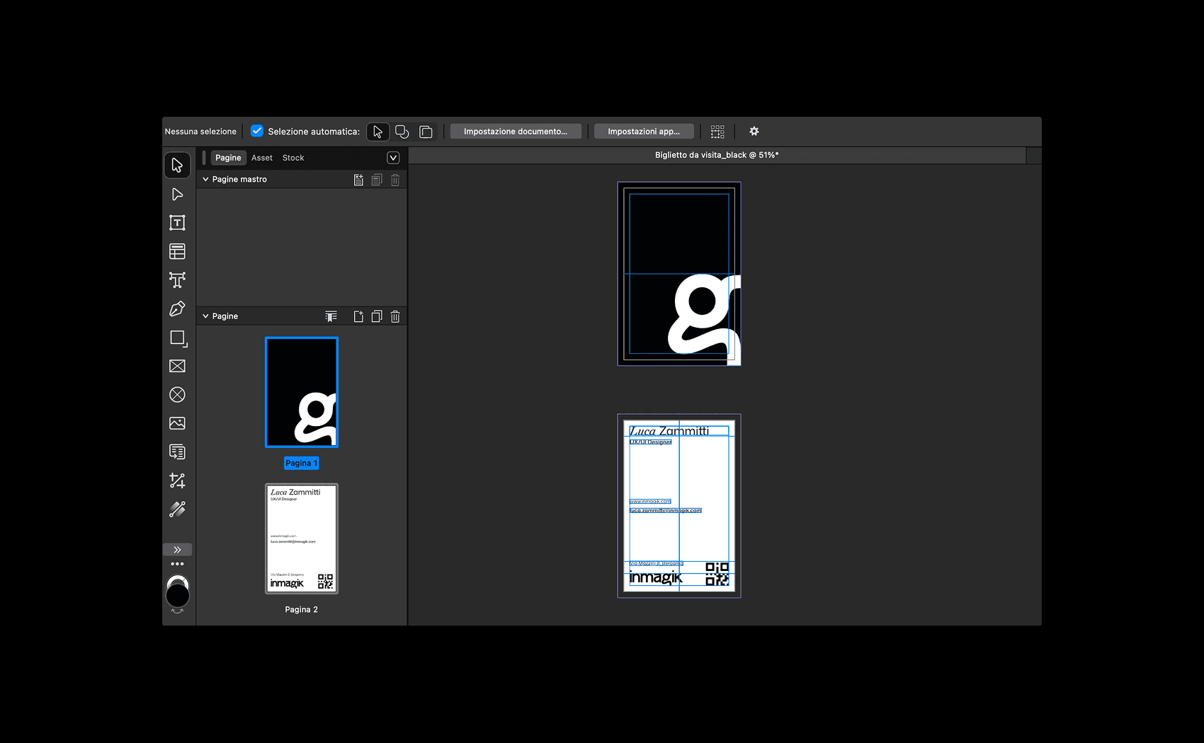
I used Affinity to design the business card, define the grids and color profile, set the clear space, and prepare the file for print.
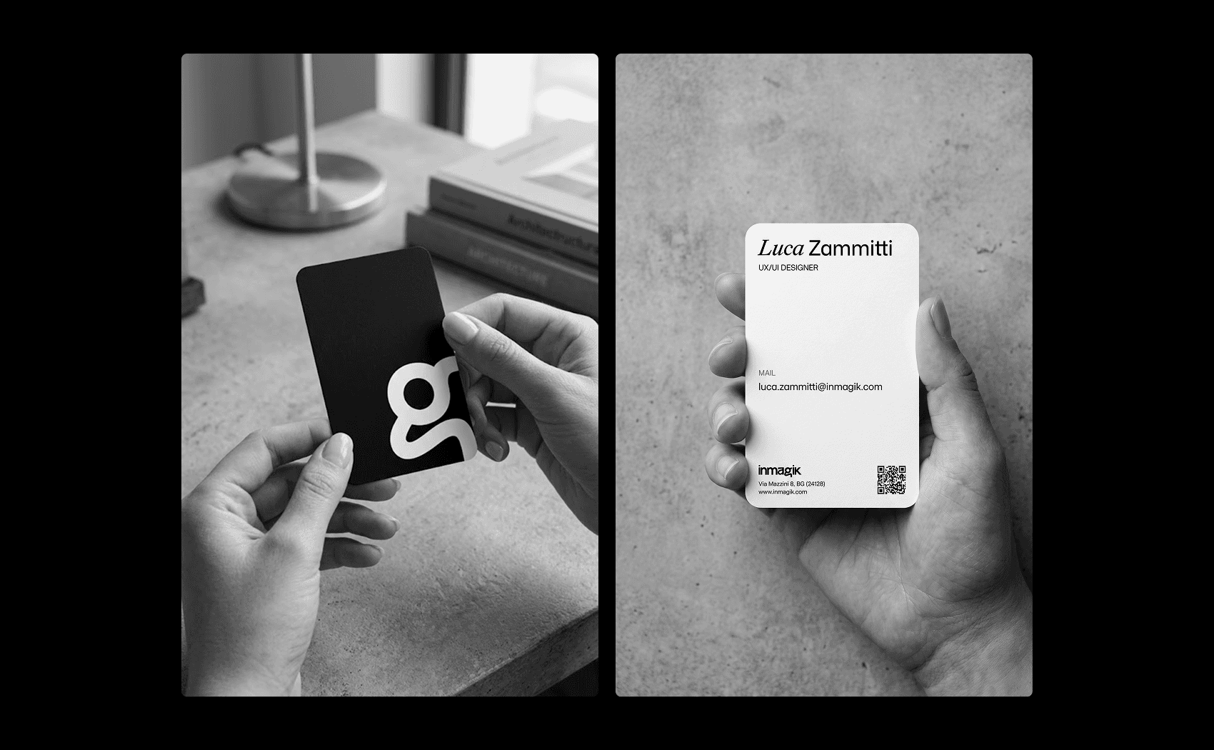
In my opinion, the vertical orientation gives the chosen logo—the letter “g”—more breathing room. The QR code on the back provides the phone contact via vCard, where available, or redirects to email.
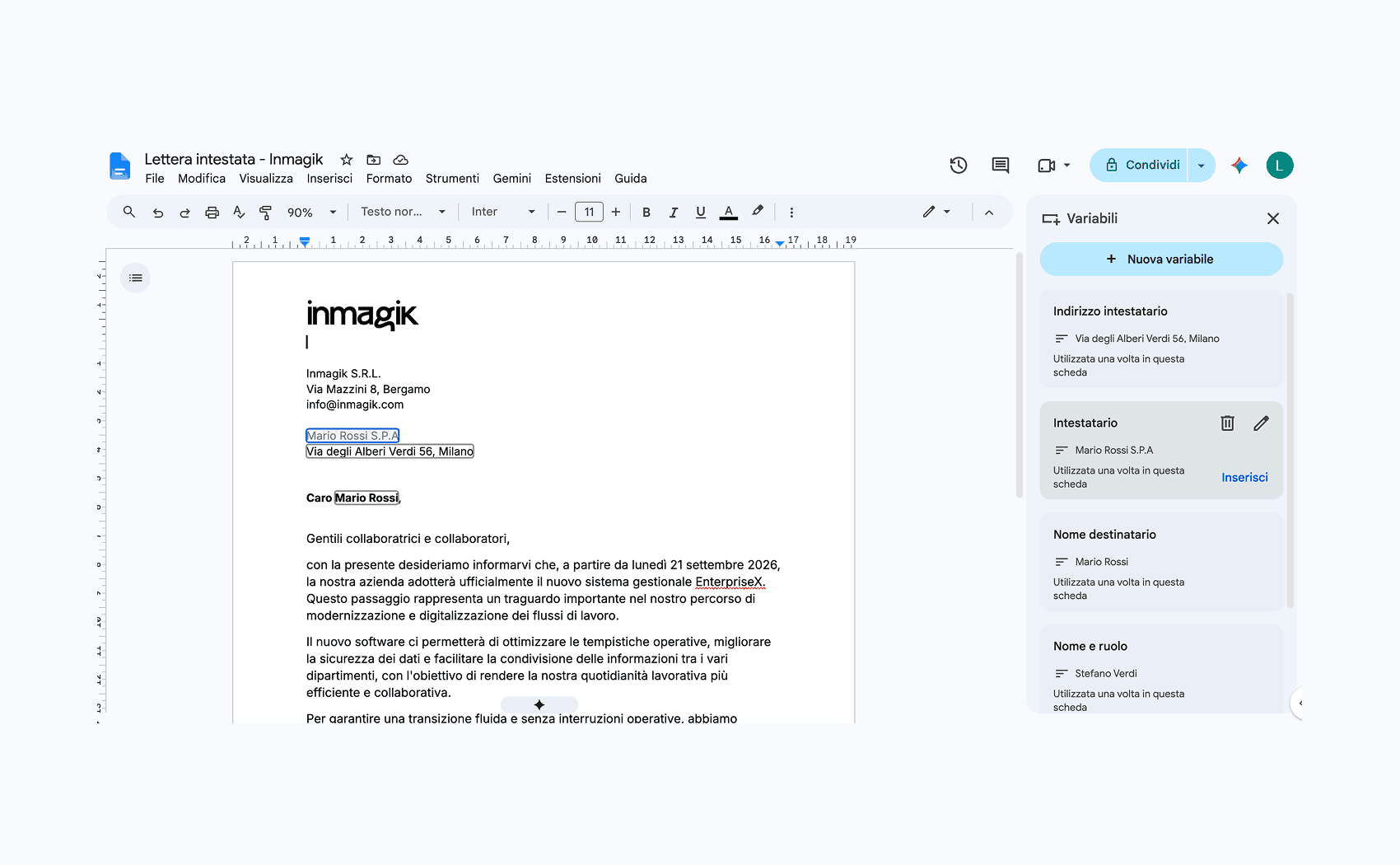
At Inmagik, we use the Google Suite. To speed up the creation of letterhead documents, I decided to use Google Docs variables, allowing us to have a fixed letterhead template that can be quickly edited.
Website starting point
The largest and most important digital touchpoint for us is, naturally, the website. Once the physical touchpoints were completed, focusing on the website was the obvious next step.
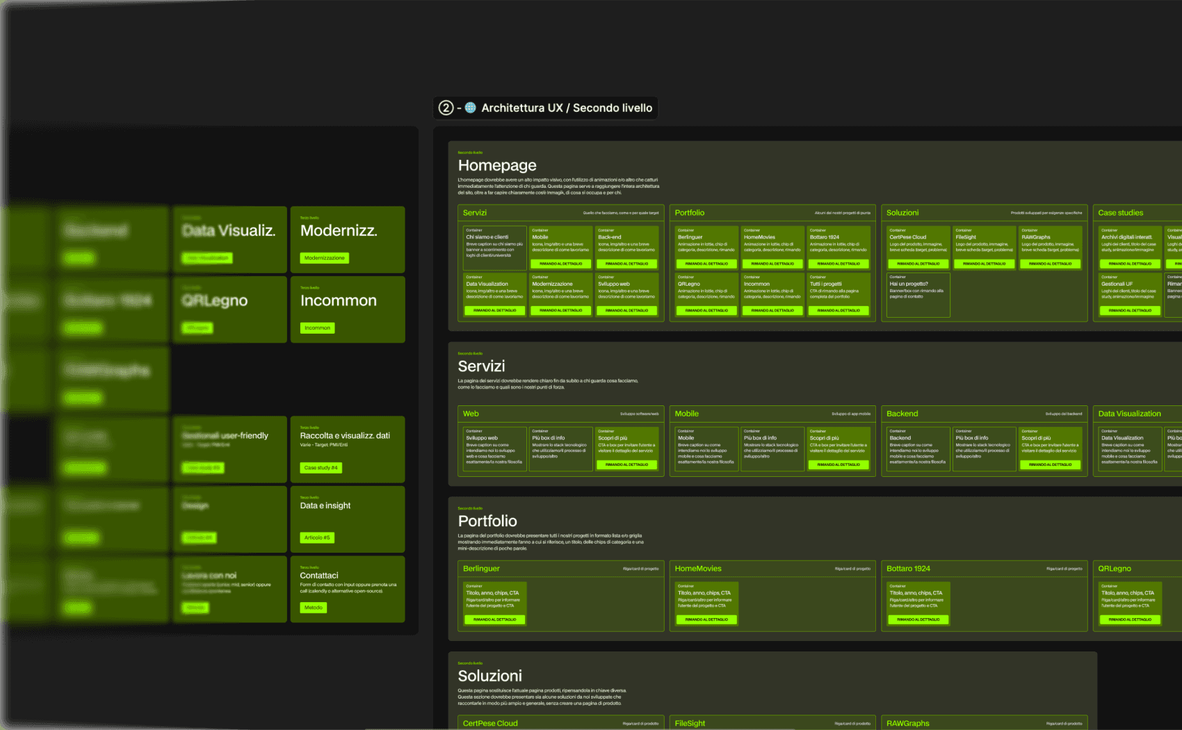
The first thing I did was map the website’s existing UX architecture, then rework it into a new one, removing anything that was unnecessary or difficult to maintain (such as the blog) and adding a few new pages.
Framer development
At first, we had envisioned a “standard” development process: designing in Figma and then handing everything off to the developers.
However, we realized that we could both shorten development time by using Framer and make it easier to add micro-interactions, transitions, and a design direction closer to what I had in mind.
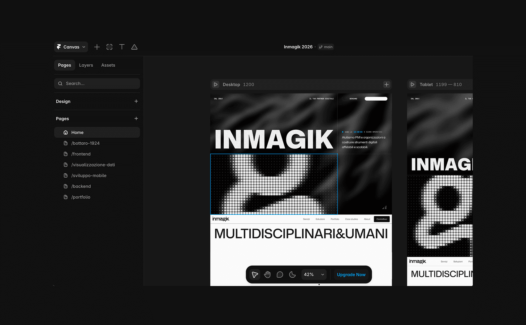
Designing and developing directly in Framer allowed me to build many custom components and implement them immediately, without having to go through the developers.
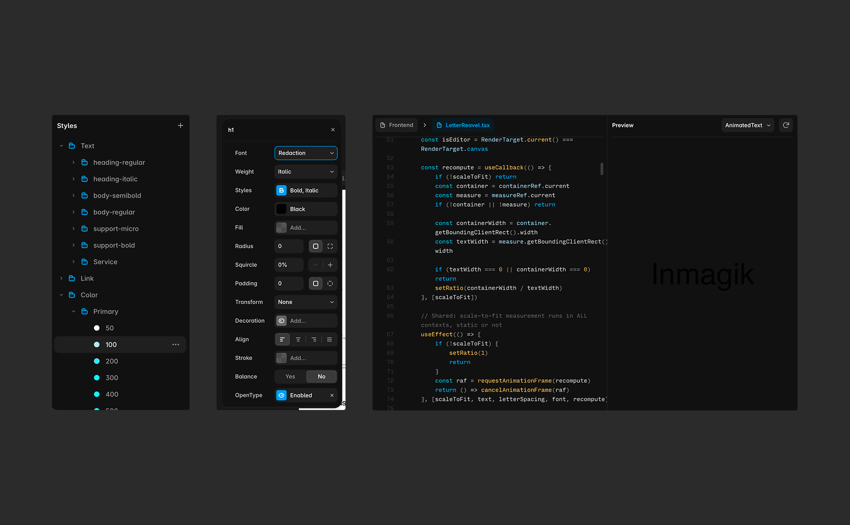
Managing typography, color, and grid styles is similar to Figma, and I find Framer particularly comfortable to work with. I also use AI to help me create custom animated components using Framer Motion.
Partial preview
As of today, the design and development are progressing well, and the website is currently under construction. Below, I’ve included a preview of the homepage.
Once all the website components have been defined, the next step will be to focus on the copy and on how to showcase and communicate all of our work.
Final thoughts
For me, this is a huge challenge, because I’m working across numerous touchpoints, both physical and digital. Completely redesigning the website as part of a broader rebranding has been an incredibly stimulating challenge for me.
I will continue along the path I outlined earlier, focusing primarily on the website, with the goal of launching it as soon as possible.
Personal learnings