La Rosa dei Gusti
La Rosa dei Gusti
La Rosa dei Gusti
Industry: Food
Client: La Rosa dei Gusti
Year: 2023
VISUAL DESIGN
MOTION

01
Brief
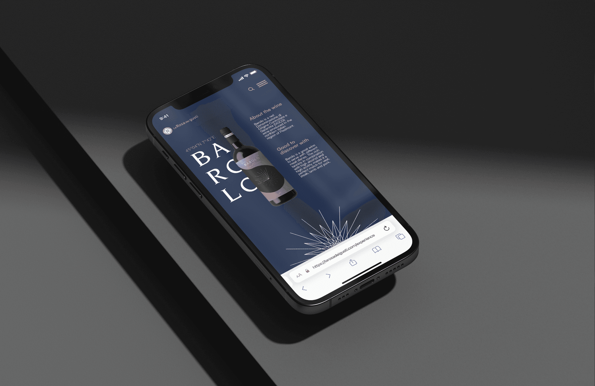
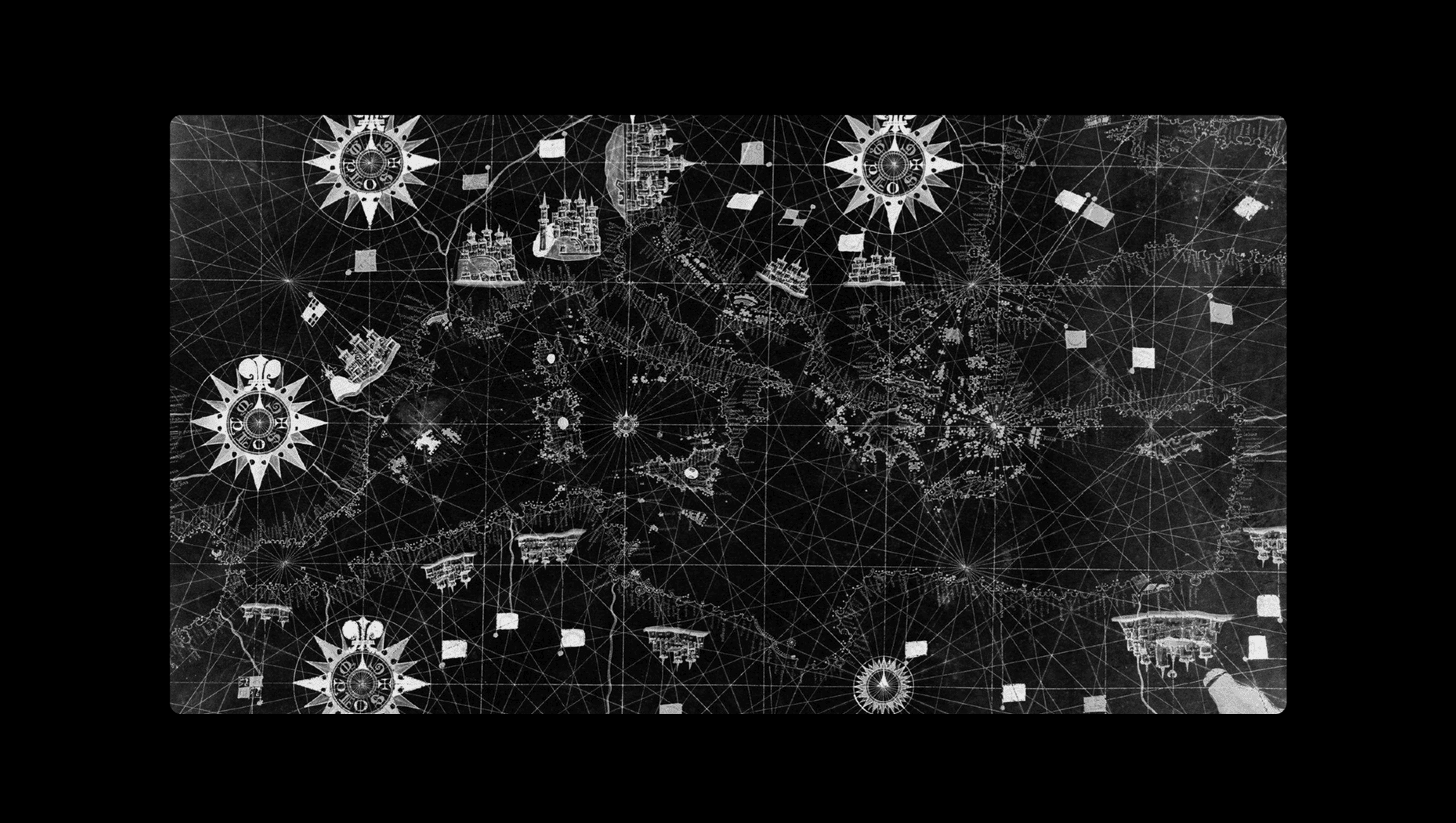
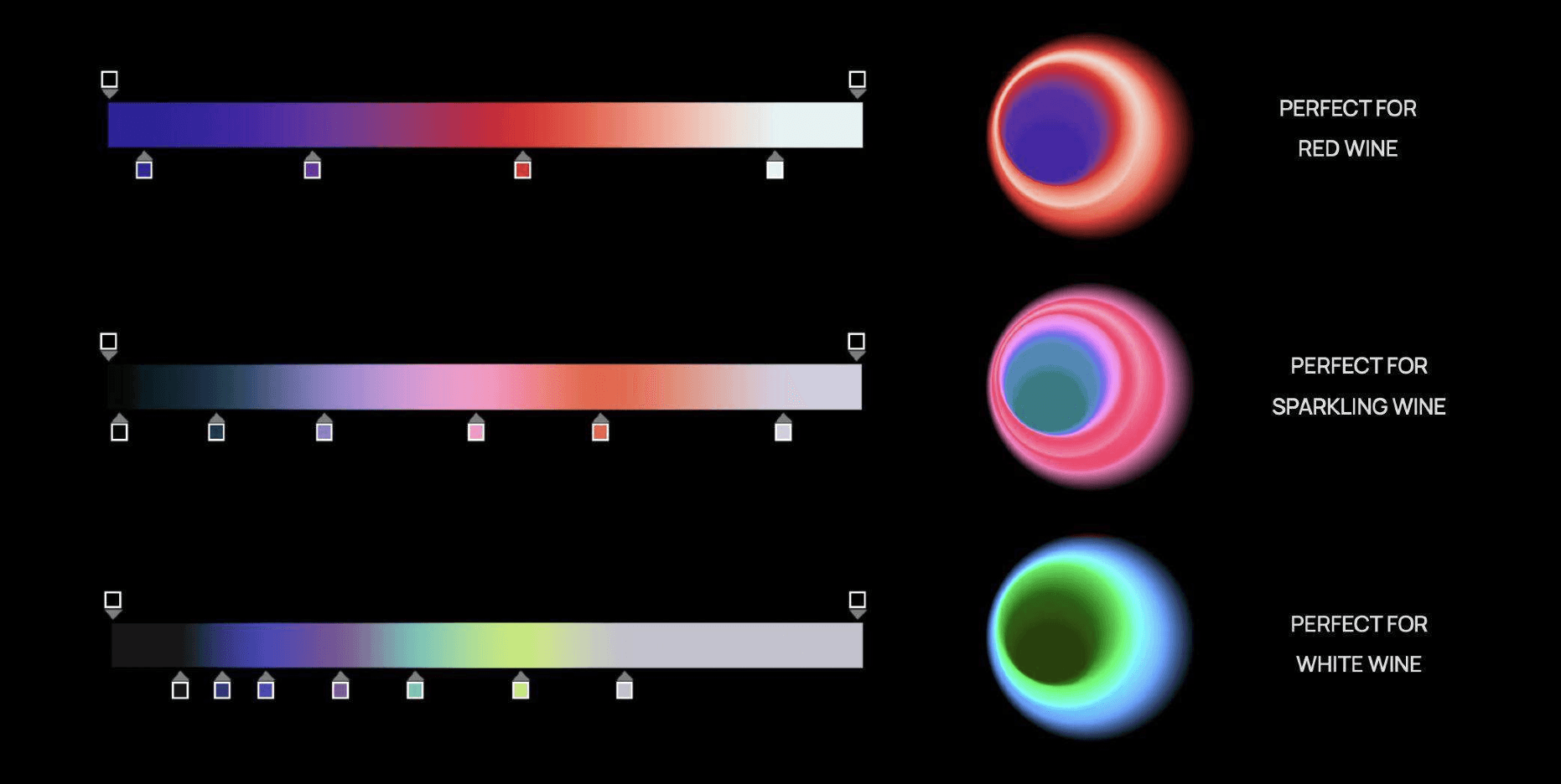
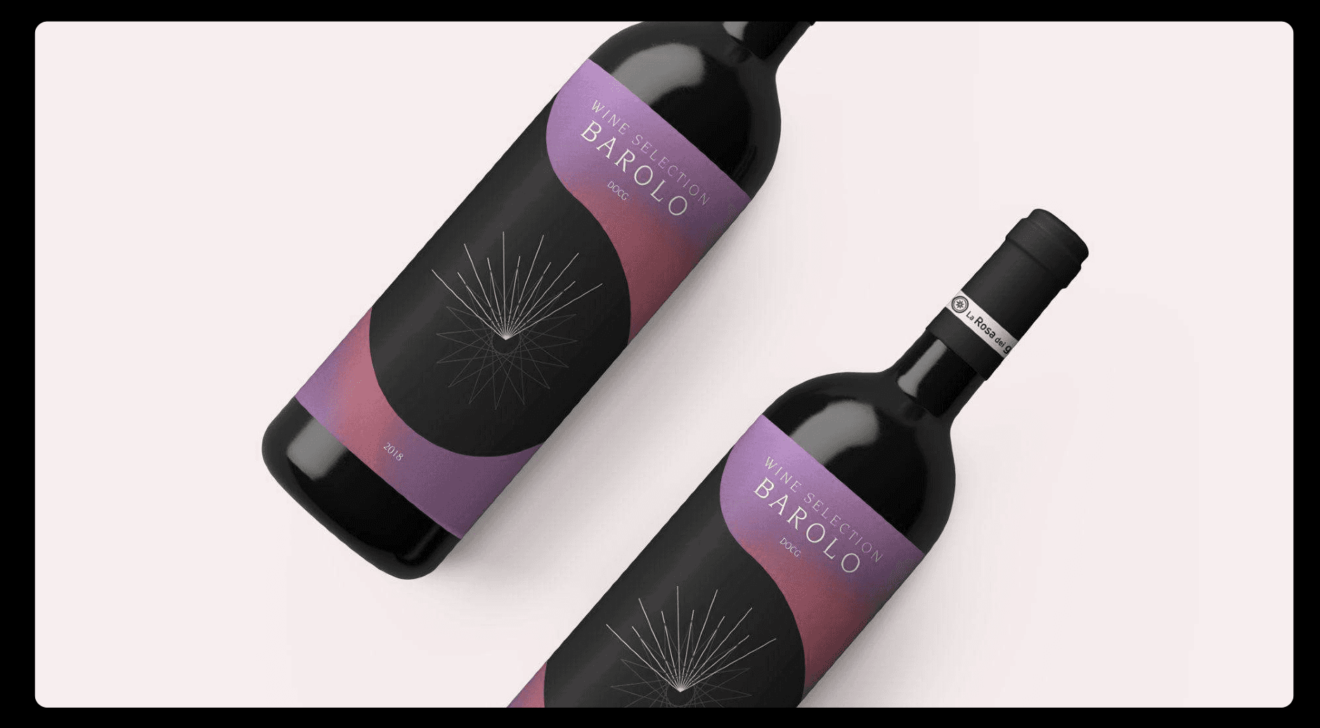
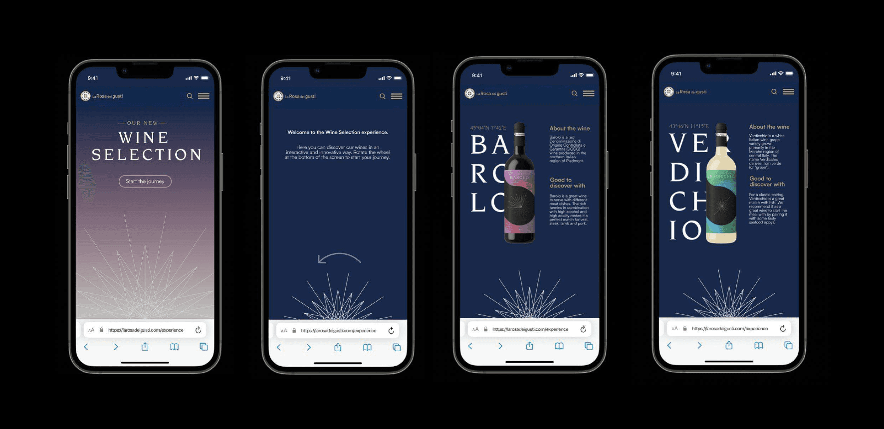
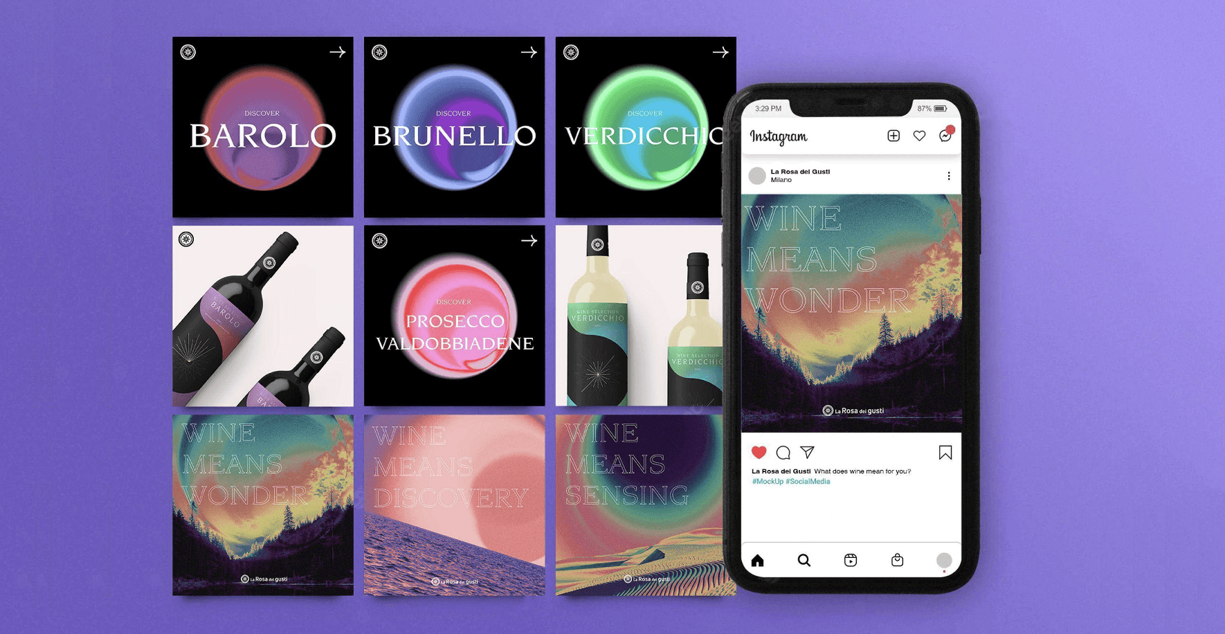
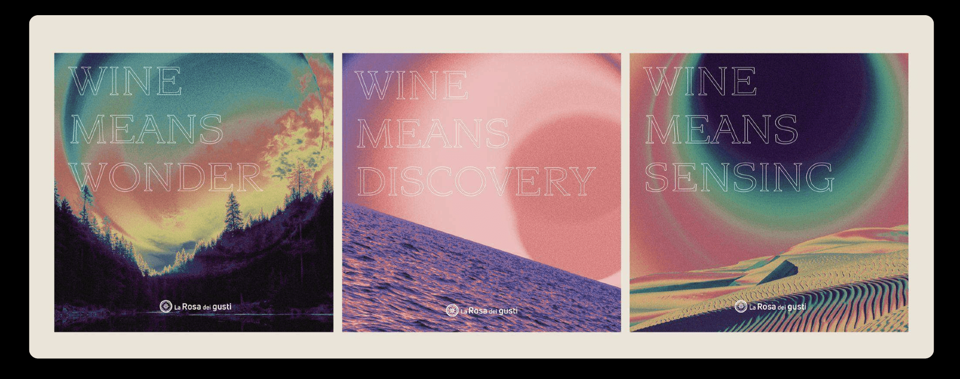
The aim of the project was to deliver a rebranding of the La Rosa dei Gusti brand, encompassing a wide range of assets, from analog and print materials such as wine labels to the digital branding presence.
02
Client
The client is La Rosa dei Gusti, a food brand that sells its products through selected supermarkets.
03
Team
I had the opportunity to present this project during my master's degree, along with two other collegues.
LA ROSA DEI GUSTI
Challenge
The main challenge of the project was to find compelling elements that would refresh the brand, as requested by the client, while steering it toward a more modern and contemporary direction.
LA ROSA DEI GUSTI
The aim of the project
The aim of the project was to give the brand a clear narrative. I chose the theme of travel and exploration, drawing inspiration from the existing compass-shaped logo and blending it with themes of Italian identity (all products are made in Italy), the Mediterranean Sea, and travel as a sensory experience of taste.
LA ROSA DEI GUSTI
Approach and solution
One of the approaches was to focus on the “shades of taste” for the wine labels, combining the idea of flavor nuances with color gradients, each one distinct for a different type of wine.
LA ROSA DEI GUSTI
Final outcome
The final outcome clearly represents a step forward in terms of modernity. In addition, the presence of eye-catching wine labels is a definite strength. As for the digital experience, the branding consistently follows the same design direction.
02
Client
The client is La Rosa dei Gusti, a food brand that sells its products through selected supermarkets.
03
Team
I had the opportunity to present this project during my master's degree, along with two other collegues.


LA ROSA DEI GUSTI
The aim of the project
The aim of the project was to give the brand a clear narrative. I chose the theme of travel and exploration, drawing inspiration from the existing compass-shaped logo and blending it with themes of Italian identity (all products are made in Italy), the Mediterranean Sea, and travel as a sensory experience of taste.
LA ROSA DEI GUSTI
Challenge
The main challenge of the project was to find compelling elements that would refresh the brand, as requested by the client, while steering it toward a more modern and contemporary direction.


LA ROSA DEI GUSTI
Approach and solution
One of the approaches was to focus on the “shades of taste” for the wine labels, combining the idea of flavor nuances with color gradients, each one distinct for a different type of wine.


FINAL OUTCOME
FINAL OUTCOME
FINAL OUTCOME
FINAL OUTCOME
FINAL OUTCOME
FINAL OUTCOME
FINAL OUTCOME
FINAL OUTCOME
LA ROSA DEI GUSTI
Final outcome
The final outcome clearly represents a step forward in terms of modernity. In addition, the presence of eye-catching wine labels is a definite strength. As for the digital experience, the branding consistently follows the same design direction.
Challenge
Branding and digital assets
Make the brand more modern
Visuals should match concepts
Solution
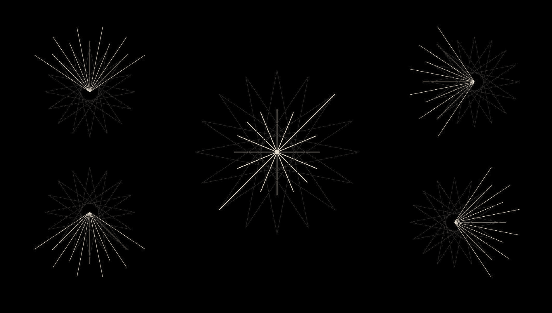
An eye-catching branding
A modern visual solution
Coherent visual design and UI
Stack used
Figma
Adobe Photoshop
Adobe Illustrator